A WELL-KEPT SECRET! It is not uncommon when I mention University of The Third Age to retired people, they do not know anything about this organisation and the variety of resources on offer. Guess what! U3A does not want to be a well-kept secret!
THEY WANT SENIORS to be life-long learners and follow up that long-held wish to learn a Language, know more about Art, History, Creative Writing, how to use that Excel program on their computer and many other classes and activities from Scrabble to Healthy Living, keeping both mind and body working well—with no end-of-term exams.
U3A BRISBANE IS INVITING SENIORS from across the greater Brisbane area to discover the benefits of lifelong learning at an Open Day on Saturday 9 September, 2023. The event will run from 9.30am to 12.30pm at its City Campus (nextdoor to Anzac Square) on the 5th floor at 232 Adelaide Street, Brisbane. There is a carpark nextdoor and the building is minutes away from BCC buses and Central Station.
President Gabrielle Power West explains: “We are excited to welcome everyone to our Open Day. U3A Brisbane is not just about learning, it is about fostering a sense of belonging, creating an environment where seniors can continue to engage positively in our community.”
UNIVERSITY OF THE THIRD AGE The name says it all! There are over 200 branches Australia-wide: U3A Brisbane is a non-profit organisation run entirely by volunteers with a limited advertising budget. I have been attending classes for three years now and I know they are hoping to reach as many people as possible for this informative Open Day. Please tell your family and friends, carers and seniors new to Brisbane. Bring them along to discover this not-so-secret and highly accessible resource in the heart of Brisbane.
OPEN DAY OPPORTUNITIES will be provided for visitors to— • Explore the diverse range of courses on offer. • Find out about the benefits of participation in U3A. • Connect with their friendly tutors who are keen to share their knowledge in an inclusive and enjoyable learning environment. • Discover the camaraderie that makes U3A Brisbane a thriving community of like-minded people.
TUTOR A CLASS U3A Brisbane is always keen to hear from people who would like to share their knowledge or passion with others. Being a tutor can be rewarding in its own right. If you are reading this as a current member, have you considered running a course yourself? Do you know someone who is knowledgeable or passionate about a subject who would be prepared to share that by taking on the role of tutor/facilitator? There will also be an opportunity at the Open Day to ask about what is involved in being a tutor and the support U3A can provide.
ALL ARE WELCOME Admission is free. Light refreshments will be available. Please assist with catering by registering your intention to attend using this link or visit their website.
LIFT THE LID and spread the word about U3A. Impress your grandchildren, tell them where you go to school. Let everyone in on the secret!
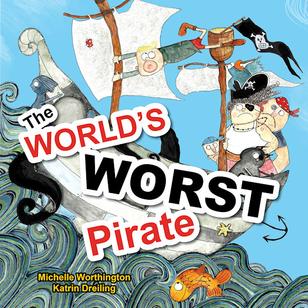
Katrin Dreiling went from language teacher to illustrator and received prestigious recognition for her picture book illustrations in “The World’s Worst Pirate”. This book, written by Michelle Worthington and published by Little Pink Dog Books, has been awarded Notable Book of 2018 by Children’s Book Council of Australia.
Willkommen! Welcome!
It’s wonderful to have you here, Katrin, I love your beautiful art techniques and I’m excited to learn about your journey as a children’s book illustrator. First, here’s a sneak peek at this special pirate story:
William is The World’s Worst Pirate so does that suggest he’s rude and nasty? Read on…
“Pirates are swashbuckling, treasure hunting, buccaneers of the seven seas. But if your mother is the Pirate Captain and you can’t stand on deck without getting seasick … that makes William The World’s Worst Pirate.” However, young William does have a special talent. Can he use it when the ship is under attack? Save the day, me hearty!
Q&A illustrator background
Katrin Dreiling, originally from Germany, loves to come up with quirky creations that inspire children to get creative. She enjoys giving colourful and messy art classes and says “Children are the true perfect grown-ups. Their hearts and minds are pure and good and it is important to nurture this – I strive to do that with art.” On the studious side, she provided the characters for animated University lectures and Government staff coaching videos that attracted over 320,000 views worldwide. In her free time, Katrin relaxes with her husband, three children and their Golden Retriever.
Q1. What is your favourite part of “The World’s Worst Pirate”?
Thank you, Gretchen, for this interview! My favourite part text-wise is when the Kraken attacks and everyone is supposed to run for their lives. Then there is a silence and Will quietly throws a cupcake to tame the beast. I like the contrast between noise and quietness and that it is such a peaceful, gentle approach. In terms of illustrations I think I like the cover the best. I just really enjoyed doing those ocean waves.
Q2. Of all your creations, who is your best loved character so far?
That would be Anton the Pig. This character has been in the works for a while now and so I really got used to him being around. He is also very sweet-hearted and funny and reminds me of a certain someone…
Q3. Where did the inspiration for this character come from?
Anton and his world are certainly inspired by my German background. The region I grew up in is known for their excessive bicycle riding because it’s very flat. So Anton is a passionate cyclist but I merged the landscape with a lot of ideas I picked up while living in Brisbane, Queensland. The inspiration for Anton’s story, though, came from years of working with children at school and my own three kids.
Q4. How would you describe your creative process on an average day?
My working day usually starts with a good walk with my Goldi to keep him happy and clear my head. Then I usually work down a list of things I have to do for my illustrating business. Once this is done I start creating. This can include simple sketching, commission work or extending my portfolio.
Q5. Do you like working in a group or home-office environment?
I am very happy to work by myself from home but I do seek professional input from other industry professionals on a regular basis. There is the Brisbane Illustrators Group where I made many good friends, WriteLinks and our local SCBWI group. I think it is very important to stay connected in which ever way you prefer, be that online or in real life.
In costume The World’s Worst Pirate book launch
Q6. Was it enjoyable working with writer Michelle Worthington?
Absolutely loved working withMichelle Worthington and would always choose to do so again. She is professional, smart and supportive and I felt very appreciated in my illustrating.
Q7. What is it like collaborating with an editor and publisher?
In the case of Little Pink Dog Books it was the perfect synergy between author, publisher and illustrator. Kathy and Peter Creamer were very inspired to keep this project a creative process which involved everyone in the same measure, and I believe the result reflects this very well. When I worked with other publishers it was a different, yet also enjoyable experience. I had to meet more firm requirements and learned new things along the way. I think you have to be adaptable as an illustrator in order to deliver the best possible outcome for the project.
Q8. Do you like to work with artistic freedom or a strict deadline?
I can do both 😊
Q9. Have you stayed up past midnight to finish an assignment?
Yes. I have worked through nights but if the work does not feel like work it is not a problem.
Q10. Have you ever received harsh criticism for your work?
I have been very lucky so far and mostly received constructive criticism which I value a lot. It’s easy to get too complacent and lose distance to your work. This is why I regularly book in for portfolio assessments with editors to get a fresh perspective on my work.
Q11. What is your favourite medium to work with and why?
I mix a lot of media together because I enjoy many things at the same time. I seem to always come back to ink in some form, though.
Q12. What colour would you be if you were an extra pencil in the box?
Black.
Q13. What are your thoughts on hand-painted vs computer generated artwork?
It works really well TOGETHER if you know how to.
Q14. Who are your favourite artists and have they influenced you?
Absolutely adore the work of Beatrice Alemagna. She has inspired me to go my own way, like she did. Then there is the quirky and unconventional style of Russell Ayto that I love. I think both artists truly work to delight and inspire children.
Q15. Are you involved in teaching workshops for children?
Yes, I will be giving workshops with Michelle Worthington to children at selected libraries in Brisbane during school holidays in July 2018. Also I give workshops for both children and grown-ups at a bookstore in Red Hill, Brisbane, as well as giving regular extra-curricular art classes once a week at New Farm State School.
Q16. Do you have a special creative goal for this year or is it a secret?
For my Anton the Pig story, I’d like to finish the manuscript and illustrations completely. Also getting published by one of the ‘big’ publishing houses has always been my dream and I’m still working towards this goal.
And this Q&A draws to a close
My sincere thanks, Katrin, for your personal insights into the world of picture book illustrating. I am sure you will reach your goal and I look forward to reading all about Anton!
Hey, is anyone else left wondering who that 'certain someone' is and why Katrin would be a black pencil...
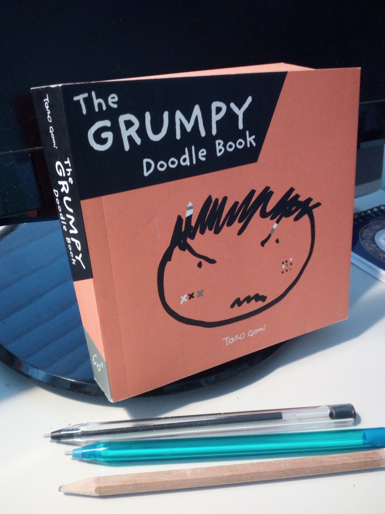
In between writing and not being published, I attempt to draw, which defaults to my basic doodle setting. My mind slips out of gear when doodling. I drew a curlicue doodle which ended up with a small snail at the end of it. Significant?
Is there a better chance of being published if you illustrate your own bookcover? Nope. Even with children’s picture books, there’s no guarantee it will be snatched off the slush pile because of the synchronicity of your fresh-faced pictures and curlicued words. In fact, in Australia the editors prefer to nominate an artist so forget that plan. Still, I can’t stop myself doodling. What use is it? (A) tension release, (B) learning aid, (C) mind clearer, (D) mind-wanderer, or who knows what. Ah ha, light bulb moment! I will research the experts and see what they have to say on the subject of Doodling 101.
Prepare to be bored, please doodle among yourselves – preferably with a real pen or pencil.
First up are the good news listicles and powerful headings:
4 Benefits of Doodling | Examined Existence
5 Big Benefits Of Being A Doodler | HuffPost – Huffington Post
7 Ways Doodling & Colouring Benefit Your Brain | Care2 Healthy Living
7 Benefits of Doodling and How to Get Started – Daring to Live Fully
Doodling Your Way to a More Mindful Life | Psychology Today
How Doodling Benefits Your Brain – Kendal at Home
How Doodling Makes You Smarter | Reader’s Digest
Study: Doodling Helps You Pay Attention – TIME
Science: Doodling Has Real Benefits For The Brain – Fast Co. Design
The Power of the Doodle: Improve Your Focus and Memory – WSJ
The Cognitive Benefits of Doodling – The Atlantic
The “Thinking” Benefits of Doodling – Harvard Health Blog …..
….. had enough?
You can’t get out of it that easily!
Here’s what JournalWeek had to say in a non-scientific way: “Doodling comes from the word doodle – a habit of unfocused or unconscious drawing a person makes while his attention is actually occupied by something else. Doodles are generally simple and sometimes nonsense drawing that may have definite representational meaning.
Today, doodling is fondly considered a ‘national’ pastime mainly because it is done by a lot of people in different settings, but mostly in classrooms and offices. <Using a pen, or more recently using laptop, tablet or smart phone apps> Some examples of doodling are found in school notebooks, mostly in the margins, caused by a student who is either lacking interest in the class or day dreaming. Another example is when someone is having a long telephone conversation while a pen and paper are within range.
What’s interesting about it? For many people, it’s just a typical way of occupying themselves. Not a lot of them realise that doing it does actually provide some benefits. Let’s find out how…
Memory Link: Admit it – you doodle perhaps in most instances where there is a chance to. Most of us could not deny it because we have developed the habit as students. What you remember and what sticks in your mind are usually the things you doodle. For instance, it can be trees you always see outside your bedroom window, logo of your favourite team, or the name of your favourite band, singer or celebrity.
The products of doodling are the images and words coming out of your subconscious mind. Although they seem to be of no significance, they can actually be helping you in learning and grasping knowledge.
One health benefit of the habit: According to the Applied Cognitive Psychology study, doodling allows us to be able to effectively recall information hidden within our subconscious. The same research found out that the people subjected to the experiment that filled in shapes while listening to the phone had a better memory retention or recall percentage. The different is about thirty percent compared to those people who did not doodle.
Being Productive: Although not yet proven, the hypothesis is that the habit itself is effective in minimising and combating daydreaming and absentmindedness. But the power of doodling is not limited within the bounds of memory and recall alone. There is a widespread belief that it, in fact, corresponds to empowering one’s intellectual prowess. As it appears, someone who’s doodling seems to be distracted or plainly unfocused.
However, this is an activity that gives the brain an awkward but beneficial exercise of engagement and processing of complicated thoughts and ideas. Likewise, those who rely on their talents of creativity also use doodling to unlock that artistry and creativity in them.Not convinced? Read about some of the most notable people in history who themselves admit that the habit has in fact helped them focus, recall, and literally make use of their brains. The list includes the likes of Leonardo DaVinci, Sylvia Plath, Presidents Bill Clinton, Ronald Reagan and Thomas Jefferson, as well as poet John Keats, mathematician Stanislaw Ulaw, Franz Kafka and Mark Twain.
Therefore, if you have issues about paying attention and focus, doodling will help you deal with those issues. There’s really nothing wrong or you won’t lose anything if you start to developing the habit.” <And maybe gain a small work of art>
Most of this blog post was brought to you by JournalWeek!
“Our aim and mission is to provide our readers articles on interesting facts”
http://journalweek.com/interesting-facts-about-the-power-of-doodling/
I think the saddest doodle belongs to Jorge Luis Borges, writer, essayist and poet, who drew a self-portrait after he had gone blind.
Jorge Luis Borges self portrait when blind
“I have always imagined that Paradise will be a kind of library”
– Jorge Luis Borges (1899-1986)
Can you tell a book by its cover? Sure you can! Just the same as an individual’s personality and clothing can tell something about them, a book lures the reader with an enticing cover image. That visual reveal, a hint of what’s hidden within the book is a very important marketing tool.
A contemporary bookcover, no matter what the genre or category, has to be identifiable. It has to look good on publicity material, it has to create a mood and it has to appeal to its target audience. The font style, back cover blurb and all-important artwork join together to get you interested enough to part with your money. Unless you are borrowing the book from your local library. Nevertheless, you will still be interested in that lurid hardback in your hand because it promises so much…just look at that out-of-context quote from a famous author who said “chilling depth” and “sizzling romance” from a “writer with imagination”.
Millions of modern eye-catching bookcovers are perfectly serviceable and practicable and sensible and don’t mislead the intended reader. It can be argued that bookcover images only hint at a small portion of the entire book. But, as a person who reads books very closely, I disagree. I like to make my own assumptions and not be misled by skewed artistry.
Thus I start my LONG bookcover show-and-tell, documenting that which has annoyed me for some time – the all-to-obvious artwork on bookcovers, those illustrations which give the game away.
The reveal: I loathe it when the crime bookcover shows the pivotal moment in the book. A dead giveaway! Is that the graphic artist’s fault for reading the front and back page? Is it the publisher’s fault for handing out the last chapter?
Bookcover clue giveaway: I have just finished a police procedural and the creepy black-and-white cover photo with a rundown house on the hill encircled by barbed wire is actually where the bodies are buried. No kidding, I knew every time the detective went up that hill, he was darn stupid. Or the one with the sketch of a child on a rocking horse holding a scythe over her shoulder – storyline crumbles before it starts. Worth mentioning that a rocking horse was not even in the story.
Vignettes snipped from a chapter: Like historical fiction “Golden Hill”, where a sketch of the hero is seen on the bookcover leaping across a roof top in true Hollywood style, no doubt aimed at action-loving readers, when the bulk of the story revolves around cruel social hierarchy.
A mystery novel: Well, murder actually because several people end up getting killed. This illustration managed to ruin the first three punchlines in the first three chapters. Not to mention the good guy is seen working in the downstairs office window when his office is upstairs. Plus the red motorbike heading up the road outside is meant to be him, at the same time. Lovely drawing but couldn’t they have chosen something more accurate?
Overcooked Clones: There’s the hand frozen in ice (guess how the victim dies) there’s the bridge across the river (guess how the victim dies) there’s the threat (a big dark old building) there’s a corrupt political serial killer millionaire mowing his way through rich widowed neurotic socialites on board his yacht (guess how the victims die) or bones poking out of the earth…black crow…wolf in snow…lonely highway…stark tree…dropped gun…body part…the train racing through the underground station…all overdone crime tropes.
To quote Tim Kreider, essayist: “The main principles of design—in books…is your product must be bold and eye-catching and conspicuously different from everyone else’s, but not too much! Which is why the covers of most contemporary books all look disturbingly the same, as if inbred.” Which leads into––
Dark silhouette: I, for one, thoroughly dislike the brooding male or female silhouette in a heavy coat, head down, walking toward a menacing city skyline/bridge on a rain-soaked evening. Boring! The stock standard photo silhouette has been on countless bookcovers for years. Think of Lee Child.
Expected bookcovers or Clone II: Why does (1) Romance have the obligatory well-developed over-muscled man and well-developed bust-overflowing woman, and (2) Literary fiction has a sedate, toned, almost elegant layout with a design which purrs good taste? (3) Non-fiction is so varied it usually has just a colour photo with a word overlay. (4) Historical fiction will have a woman in period costume gazing at house or hillside. (5) Children’s books, fantasy and science fiction have a place all their own. Renegades breaking up the predictable.
Flip side: An irrelevant illustration. There are obscure bookcovers like “The Midnight Promise” with two hands shaking as though in agreement when the Promise is nothing like that image. At least it gave me something to ponder.
World-wide: I’m commenting on English language publications and referring to p-books and e-books. I’ve mentioned arbitrary books I have read and tried not to name them. However, the same book published in different countries gets a different bookcover. This is where designers and image stock can become tricksy. I have seen translated children’s books looking very adult, young adult books looking too adult, and adult books looking sugary sweet, e.g. cosy mystery covers with blood-thirsty content between the pages.
BONUS: Terry Pratchett’s bookcovers by artists Josh Kirby and Paul Kidby tell a detailed story. With fiction, decide how closely you should look. Decide if you want to undermine the plot. You may not even notice pictorial clues! Ask yourself if you are exercising your own freewill, or are you conditioned by a generic bookcover image.
Today, the mass market book illustrators, the image makers, appear to acquire design inspiration from their clinical, perfectly sculptured computer programs. Perhaps they should visit an art gallery, or see what’s shakin’ in the real world, then tell that miserable silhouette model to get lost.
Never stop reading!
♥Gretchen Bernet-Ward
Postscript : A Tiny Bit of History : Literature has changed in more ways than one over the centuries. Illuminated manuscripts gave way to smaller volumes with dust covers/jackets in 1820s Regency, then refined in 1920s to make hardback books more attractive. Before this the majority of bookcovers were a plain single colour with gold embossed wording and little adornment. Swanky ones did have lithographs or a portrait frontispiece. It is considered that 1930s paperback printing changed the course of bookcover art.
Darin Jenneskens, 11, reads through the first few pages of a Hardy Boys mystery while relaxing against an aisle of books at the new Plummer Public Library. The new facility opened to the public Monday.
NEW TRICKS ‘It Smells of Books’ BBC One TX DATE: TBC Picture shows: ALUN ARMSTRONG as Brian Lane WARNING: Use of this copyright image is subject to the terms of use of BBC Pictures’ BBC Digital Picture Service. In particular, this image may only be published in print for editorial use during the publicity period (the weeks immediately leading up to and including the transmission week of the relevant programme or event and three review weeks following) for the purpose of publicising the programme, person or service pictured and provided the BBC and the copyright holder in the caption are credited. Any use of this image on the internet and other online communication services will require a separate prior agreement with BBC Pictures. For any other purpose whatsoever, including advertising and commercial prior written approval from the copyright holder will be required.
Initially I was gathering images for a compilation to promote reading but, instead, my gallery became a montage of book-reading men and boys over the last two centuries, photographed and painted, famous or otherwise. With every viewing, the images reshuffle. A montage of book-reading women and girls can be found under Part One.
Initially I was gathering images for a compilation to promote reading but, instead, my gallery became a montage of book-reading women and girls over the last two centuries, photographed, painted, and one carved in marble. With every viewing, the images reshuffle. A montage of book-reading men and boys can be found under Part Two.
Walking in a park, I saw this wall of trompe l’oeil on the side of a public convenience block and just had to photograph it. The illusion, the trick of the eye was something special which I appreciated more after I saw my photograph. It was painted by local Sherwood (Brisbane) artists with the name Half Dozen Group of Artists Inc.
One of my favourite pastimes is to change my screensaver image. I do it on my PC and iPad regularly. Silly obsession, I know, but it gives me a smile when I log on each day. I take my own photographs wherever I might be, and have a supply of snapshots and artwork amassed from family and friends over the years. Some work well, some don’t. “Framing and focus” was the old adage.
Searching
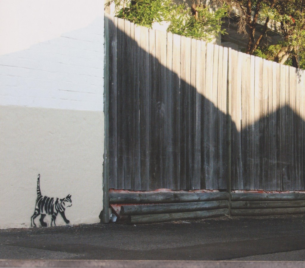
There is a children’s picture book entitled “The Stripey Street Cat” by Peter Warrington and Rachel Williams which is a photographic series of stencilled street art images of a stray cat. They tell the story of Stripey who is looking for a lost friend, meeting various other Newtown (Sydney) cats along the way.
An illustration I use regularly which attracts attention for all the wrong reasons is this one of Snoopy typing away in the middle of the night with a cigarette in his mouth. I’m anti-smoking but there’s something naughty about making an icon like Snoopy do such a thing. The artist is unknown but I think he’d have a good sense of humour.


 Q1. What is your favourite part of “The World’s Worst Pirate”?

 Q10. Have you ever received harsh criticism for your work?
 Q14. Who are your favourite artists and have they influenced you?
 Information: