My Writing Endeavours Part Two
Welcome back to my unprofessional yet eager writing exercises with U3A The Writers Collective based in Brisbane, Australia. Each week I will post a short story which I have written to read out in our group. The theme comes from our prompt Word of the Week. Each writer gets the opportunity, at least once, to chose the Word of the Week. This story is basically a memoir piece from my early years and yet to be read to The Collective. Also, at 475 words it is well over our set wordcount.
PHILLIP ISLAND REMEMBERED
Unlocking the Past
Back in the 1960s Phillip Island off mainland Victoria seemed to me, a young girl, to be a million miles away from civilisation. It was a very long uneventful drive way-back then but now in 2026 only one hour fifty minutes (142 km) on a wide motorway.
Access was from the mainland is via Newhaven and we drove across the original wooden San Remo bridge onto the island, bouncing in our seats with excitement. Looking to the right there were holiday camping sites which sat among the tea-trees and scrubby saltbushes. To the left were sand dunes and the blue, blue sea. In many places the road was sand and gravel but small houses had started to pop up so the narrow main road had a reasonably better surface than my father’s younger days. I don’t remember the small village of Cowes but no doubt today it has the obligatory coffee shops, supermarket and mod cons. There were always small fishing boats bobbing in safe havens and people fishing on the only pier I can remember.
The native animals and bushland was intacked back then and you could see Koalas in the gumtrees on either side of the road but they were high up and usually sleeping. Windows down, my brother spotted a brownish koala in the fork of a eucalypt tree watching us from one sleepy eye. My father craned his neck peering through the windscreen to see it. The car tyre hit a pothole, the vehicle slewed to the left and crashed into the tree. The koala did not blink. Whereas my mother started shouting. I was embarrassed that we had done such an undignified thing and my brother wanted to take a photograph of the whole incident with his little black and white camera.
No other vehicles were around and we were able to drive away unscathed except for the ding in the front left mudguard. I remember we found a picnic spot to eat our packed lunch of sandwiches, fruit and thermos flask tea then drove to Cape Woolamai, a rugged surfing beach with gritty sand, squalling seagulls and huge curling waves which sent salt spray into the wind.
I can recall later visiting the dusk parade of Fairy Penguins (Eudyptula minor) coming up the beach to their burrows in the sand dunes, no lights, no crowds, just small penguins going home for the evening.
Regrettably here was no mention of the local indigenous people and I am now aware that the social history of Phillip Island dates back over 40,000 years to the Bunurong people, the original inhabitants of the Western Port region. Not long ago I was appalled to discover that Phillip Island hosts car and motorcycle events on the Phillip Island Grand Prix Circuit. An even more tragic outcome, this time for the native plants and wildlife.
Unbeknown to me, our family jaunt around Phillip Island was probably packed with nostalgia for my parents. My parents and grandparents loved the place, my grandfather FC Bernet was an artisan, a skilled craftsman and he painted and sketched many aspects of the island. My father and his siblings had spent school holidays there, swimming and fishing from the jetty beside the small boats, back when the area was relatively unknown and perhaps a more peaceful destination.
I would like to be brave and re-visit Phillip Island again one day.
May this precious piece of rock and sand be preserved forever.
💗 © Gretchen Bernet-Ward 2026
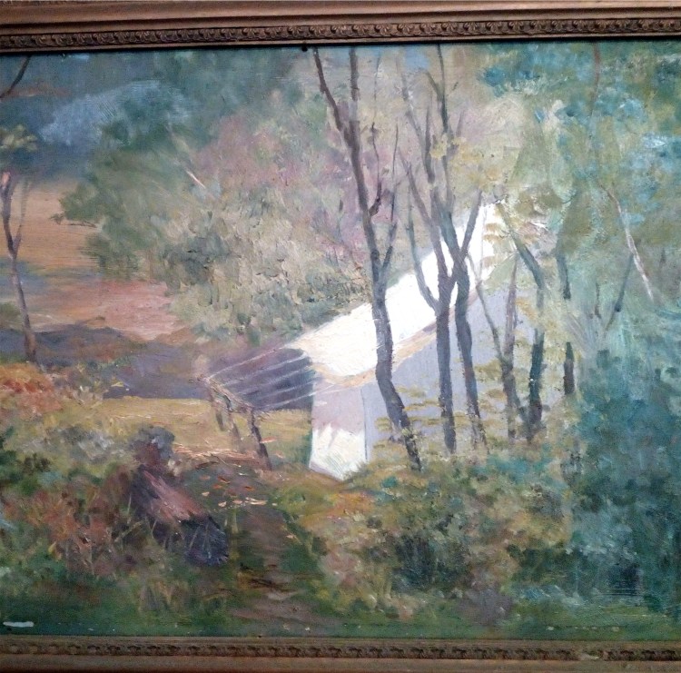
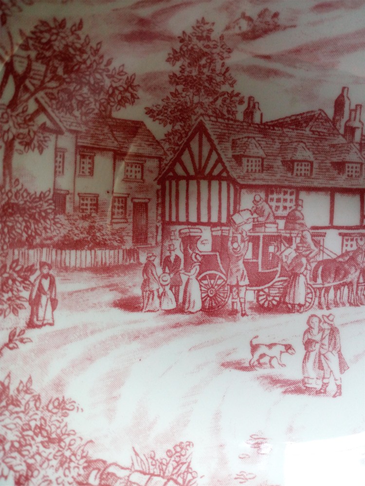
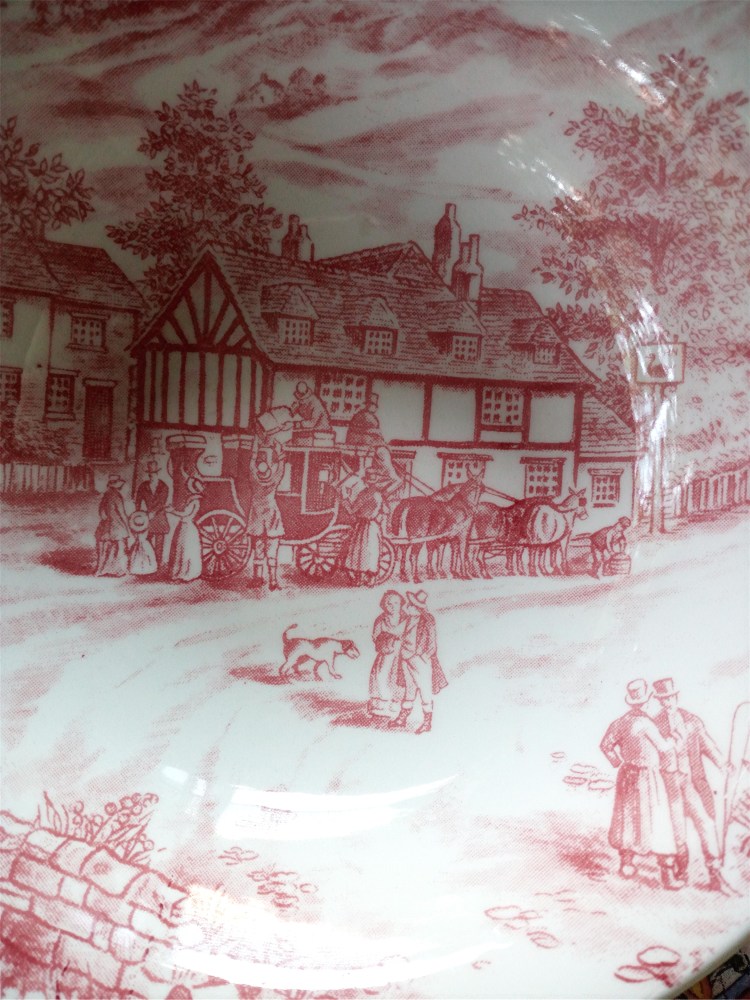
Artist of many skills FC Bernet c1950
Image © Gretchen Bernet-Ward 2026
National Simultaneous Storytime 2026!
Because my story remembers my childhood, please make a note that on Wednesday 27th May 2026 at 12.00noon AEST, millions of children, parents, teachers, and library lovers across Australia will come together to read Luna Roo the Kangaroo Baller at the same time.
So much reading fun that I wanted to give it a special mention.
Please mark the date, ready to sit down with young readers at home, school or local library to read this book together!
Last year over 2.2 Million participants were part of National Simultaneous Storytime. Could this year be even bigger? Be part of something very special and join in the free fun wherever you live in Australia. GBW.


 As luck would have it, being a fan of crime novels, the first short story I read was ‘A Candle for Bob Carter’ in which plain-clothed Chief Inspector Bob Carter is on jewel-guarding duty at a swanky fancy dress Christmas party during a hot Australian summer. ‘We’ll turn the air-conditioning up dear,” says Leila as the sound system booms the obligatory yet incongruous ‘I’m Dreaming of a White Christmas’. Such a fun twist at the end.
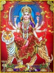 Under the tribute heading Women Worldwide, I read in awe as determined elderly ladies went ‘Walking in the Land of the Gods’. Later I laughed out loud after reading ‘Durga Down Under’ a rather irreverent look at Durga, the Supreme Hindu Mother Goddess. The accompanying poems resonated with me, particularly ‘A Woman’s Solitude’ a brief respite before a hectic day. Under the title Travel Tales, Indrani writes with clarity and insight, transporting me to spectacular locations around the world. My favourite is Shimla in the Himalayas which also has a lovely photo of Indrani and her daughter Gitanjali on rugged little ponies.
 In her foreword, Indrani says ‘I continue to look both backwards and forwards for ideas and inspiration’. I have already read and blogged her historical novel
  Indrani Ganguly was born into a Bengali family in Lucknow and now lives in Brisbane with her husband, son and daughter. She travels extensively around Australia, India and other countries.