The beautifully illustrated book ‘The Boy, The Mole, The Fox and The Horse’ by Charlie Mackesy is intended for children not cynical adults.
The content has been reproduced in countless book reviews on Goodreads to the extent that a large portion of the book has been copied.
We should all know our own country’s copyright laws. Where possible I acknowledge the source of material I use and only quote a sentence or two for emphasis in my book reviews. Copyright is adhered to in many areas including business, education, libraries, publicity, government, even blogs and hand-out leaflets.
So why do certain Goodreads reviewers think they can profusely post someone’s artwork?
Would they like their creative endeavours photographed and reproduced, and in this case vilified, and used for a different purpose other than originally intended?
I believe that by reviewing Mackesy’s work on Goodreads, a reviewer is not justified in reproducing the words and illustrations constituting a chunk of the author’s work.
“Copyright is a form of intellectual property that protects the original expression of ideas. It enables creators to manage how their content is used.”
There may be Goodreads rules and regulations in the fine print which I could not locate but I am waiting on a reply from the Librarians.
My WordPress followers know that I do not activate Comments but I suggest if you think the copying is unfair or unjustified, check the book ‘The Boy, The Mole, The Fox and The Horse’ on Goodreads and perhaps submit a message to the gatekeepers.
“I have noticed on Goodreads that generally there does not appear to be any control over spoilers or plot reveals so what hope does copyright offer Goodreads authors. Copyright is mentioned under https://www.goodreads.com/about/terms and it would appear action has to be taken by the author.” GBW.
POSTSCRIPT—Below is my contact post to Goodreads Librarians on Monday 29th March 2021—no reply has been received:
“What are the copyright limitations on posting author illustrations on Goodreads? The Boy, the Mole, the Fox and the Horse by Charlie Mackesy has had pages copied by reviewers to such an extent that they almost represent the complete book. The book contains original work by the author and has significant meaning to him while naturally being a source of income which could be impacted due to continued copying by book reviewers. I know it is hard to control copyright (particularly on social media) but I would expect a certain level of copyright control on a book-dedicated website. I have no vested interest in this book other than enjoying it, and wanting to see Goodreads and reviewers being more circumspect regarding the posting of images from inside this book, or indeed any illustrated book.” GBW.
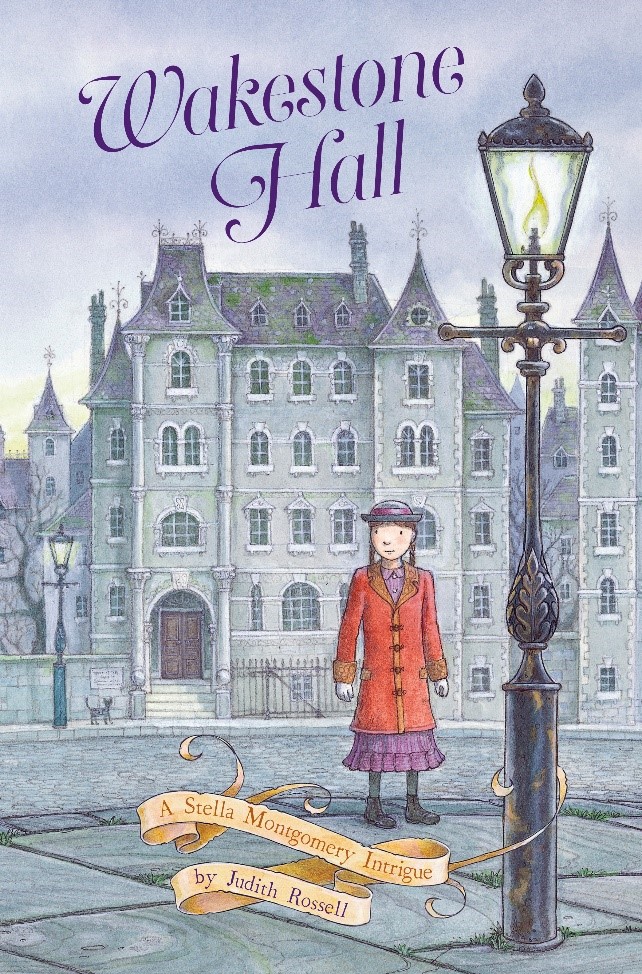
“Stella Montgomery is in disgrace. The awful aunts, Aunt Condolence, Aunt Temperance and Aunt Deliverance,have sent her to Wakestone Hall, a grim boarding school where the disobedient are tamed and the wilful are made meek. But when a friend disappears, Stella is determined to find her – no matter what danger she encounters. Soon Stella is thrown headlong into the mysteries surrounding Wakestone Hall. Will Stella save her friend in time? And will she discover – at long last – where she truly belongs?”
Stella Montgomery and Wakestone Hall – the intrigue draws to an exciting close!
Wakestone Hall is Book 3 in the Stella Montgomery Intrigues and this series has captured my imagination. My inner child responded to the mysterious and creepy goings-on in the first two books, beautifully complemented by author Judith Rossell’s own illustrations of the Victorian era. The third book is out now with a book launch due in a couple of days. I can’t wait to read it! GBW.
On Sunday 28 October 2018 at 3pm The Little Bookroom, Melbourne, is proud to launch WAKESTONE HALL the third book in the Stella Montgomery trilogy by author and illustrator Judith Rossell.
Information: HarperCollins Publisher Published: 22 October 2018 ISBN: 9780733338205 Imprint: ABC Books – AU Number Of Pages: 280 For Ages: 8+ years old
Children’s, Teenage & educational / Fantasy & magical realism (Children’s – Teenage)
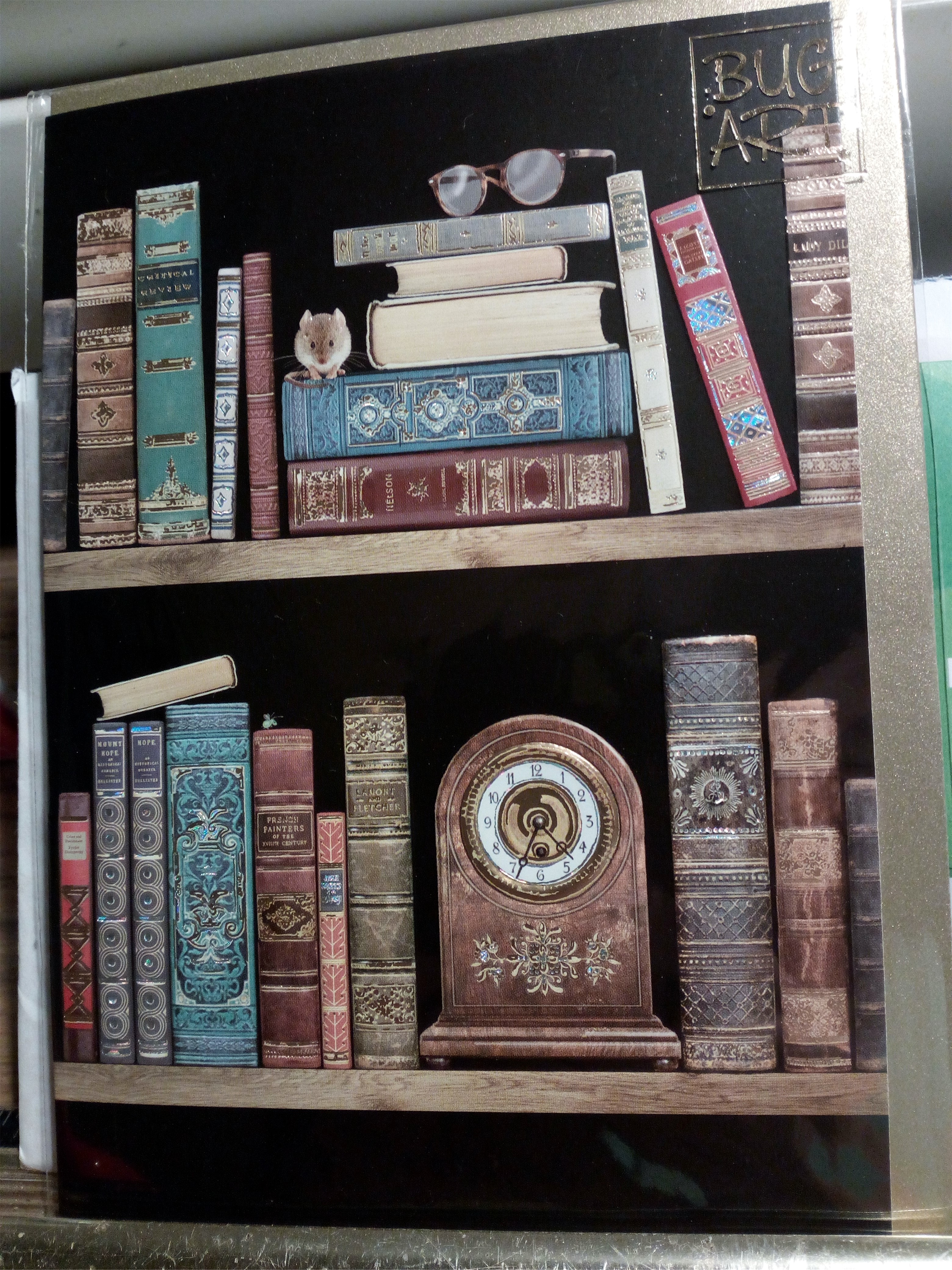
After browsing the magazines at our local newsagent, I head for the greeting card section, well-stocked with original, colourful and varied cards, all shapes and sizes for all occasions.
My eye is always caught by a card which I think would suit the receiver. Even if there’s no occasion on the horizon, I’ll buy the greeting card so I’m prepared.
This bookcase artwork is my latest purchase which came with a shiny gold envelope – I love it so much I don’t think I’ll mail it to anyone!
Another newsagent and stationery shop is undergoing renovations. The dog paintings make a nice change from blatant fashion store hoardings. Balloons or thought bubbles?
Did you know that? In the spirit of The Duck Pond, here’s a heads up from author Jen Storer of Girl & Duck.
Exciting times! Jen’s SCRIBBLES CREATIVE GROUP (writing and illustration) is having a FLASH SALE on 30th September 2018. Join now!
Yay! That’s 30% off their signature online course – 30% off on the 30th. Ink it in, okay?
Then the SCRIBBLES CREATIVE WRITING AWARDS open on 1st October 2018.
Have you got an awesome picture book manuscript or a junior fiction story you think might fly in the competition? Middle grade? An exciting storyboard? There are FOUR categories and I bet you’ve got something creative worth entering!
To read all about the inaugural SCRIBBLES CREATIVE AWARDS plus prizes and how you can win a manuscript assessment and one-hour Skype coaching call with published author Jen Storer of Girl & Duck CLICK HERE.
Jen, creator of Truly Tan series and other children’s books, says “I hope this post flips your lid. But only in a good way!”
#keepscribbling #stayinspired
To keep up with all the news (and all the pretty pictures) follow Jen on Instagram.
Visit the website Girl & Duck and ask to join Jen, Zoe, Dulcie, Geek Duck (and me, and the other Duckies from around the world, talking children’s literature and stuff) in The Duck Pond, the most unique and supportive online kidlit group around – then join SCRIBBLES for even more fun! I will definitely be entering the Awards competition!
All the links you’ll ever need to write and illustrate brilliant kids books:
My picture book review
My bonus picture book lesson
My link to Just Awesome Picture Books
THE REVIEW:
Henry is a boy who likes eating books. He absorbs knowledge as he happily munches his way to becoming the smartest boy on earth. Everything goes well until there’s an internal rebellion. Share Henry’s journey as he discovers something better than eating books.
Award-winning Oliver Jeffers’ concept is clever and I found his plot madly appealing. The illustrations are unique and show creative grunge like an old diary or well-used notebook. For me, although the story has the potential to be scary, it is handled in an adventurous way with Henry supported by believable characters which adds intertextuality to an otherwise imprudent tale.
I think The Incredible Book Eating Boy is best suited for small group readings or child-and-parent because there’s a lot happening and the visual literacy may need some explanation for younger children.
All in all, a praiseworthy picture book with a good message for 4 – 8 years range to which I give a 5-Star rating. GBW.
In my opinion, less is more! Wordy picture books tire the reader and the listener. The illustrations should highlight the uncluttered wording. The words push the narrative forward and the child uses their imagination from the visual cues.
It’s a common fallacy that picture books are easy to write. This is far from the truth because the very minimalist nature of picture books means that every single word has to be perfectly rendered. Learn more about writing for children from author Jen Storer of Girl & Duck.
As a general guide, here are some basics:
A children’s picture book is 32-pages but 8 pages are used for endpapers and book information. The story is over 24 pages or 12 spreads of text and illustrations which span two opened pages at a time. These pages can be half-page spreads, single-page spreads, double-page spreads or vignettes. A number of vignettes are used in The Incredible Book Eating Boy.
There is symmetrical, complementary and contradictory illustration approaches and I think The Incredible Book Eating Boy is approached in a complementary manner. Oliver Jeffers plays around with the location of text to good effect.
Board books, pop-ups and novelty may have no words, just illustrations. Young picture books are aimed at 2 to 5-year-olds with 200 to 400 wordcount. Trade (general readership) picture books are suitable for 3 to 8-year-old children with 500 to 600 wordcount. Picture story books for older children 6 to 10-year-olds with 1000 to 3000 words are often non-fiction. Chapter book fiction over 3500 words are suitable for competent readers, with a sliding age range due to small sketches and quirky touches often added between the pages to enhance the reading experience. YA (young adult) are the more tailored books suitable for older teenagers.
Something different. A theatre performance video of the book at The Joan, Penrith’s premier performing arts centre The Incredible Book Eating Boy production. The cast use song, movement and puppetry to bring Oliver Jeffers’ much loved story to life on stage.
Enjoy eating, er, reading this picture book with that special little someone.
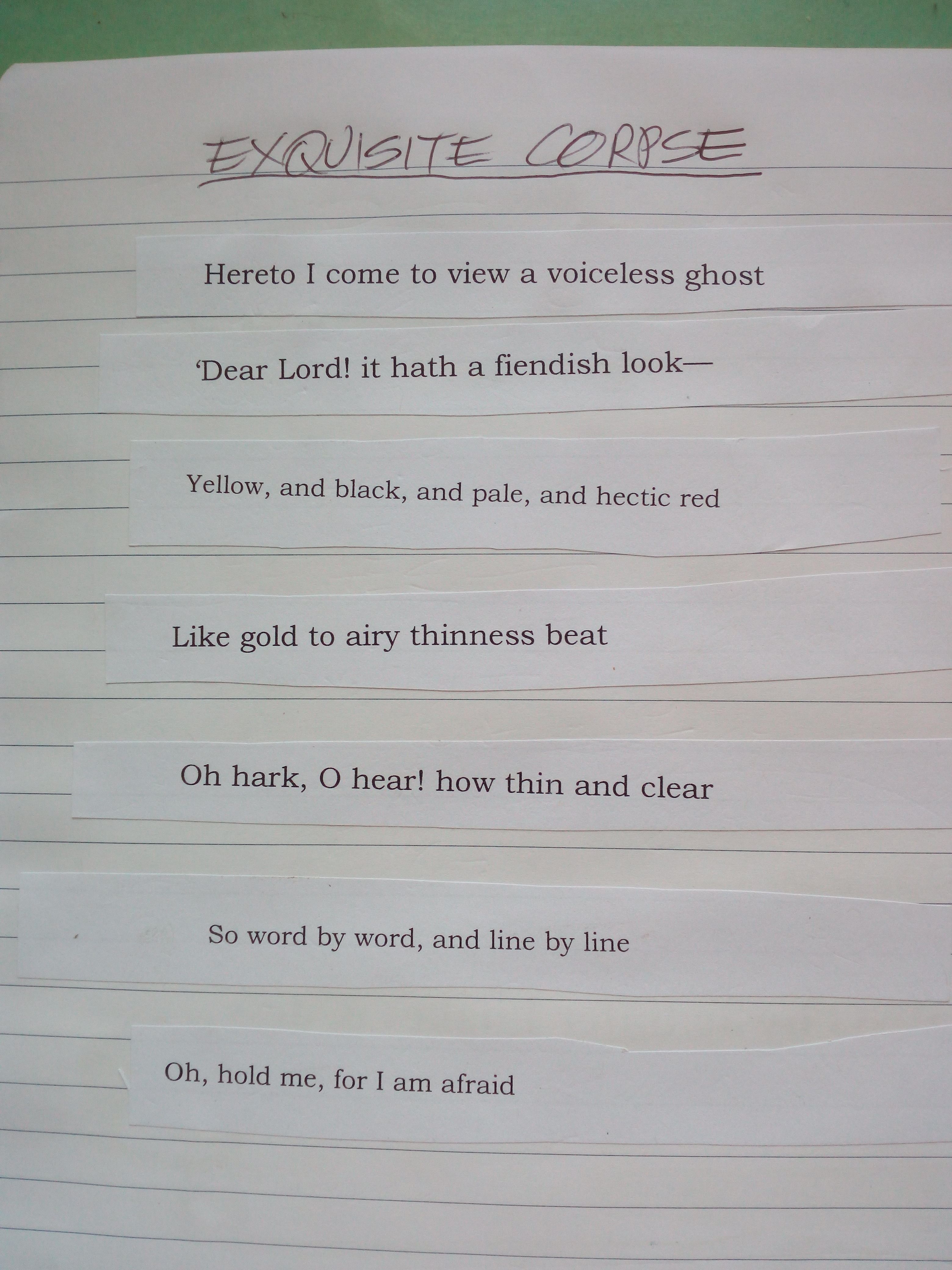
Test your memory and see if you can name any poets from the lines I picked randomly during a timed exercise (see below) “Like gold to airy thinness beat” is from Valediction, Forbidding Mourning by John Donne (1573–1631)
This game can be adapted for writers, artists, poets and movie fans!
There are two versions. The version attributed to the Surrealist Movement is when the weirdest possible head, torso, legs of the Exquisite Corpse are drawn by three different players, each folding over the paper so the next person can’t see the results until it is unfolded at the end of the game.
“Consequences” is the original name of this literary pen and paper parlour game which has been played since the 1800s Victorian Era. A random sentence is written near the top of the page. The paper is folded over then passed to several other participants who add to it and fold until it reaches the last person, or the bottom of the page. The paper is unfolded and the whole “story” is revealed––often with hilarious results.
Alternatively, photocopied lines from classic poems (see above) can be cut into strips and jumbled into a bowl. Each player blindly chooses nine strips but uses only seven to form a poem. The mind takes over, sorting and assembling into a reasonably cohesive format. The verse pictured above is what I put together in a recent Masterclass during a timed exercise. My Exquisite Corpse earned the comment “feels Gothic and dark”.
To quoteAcademy of American Poets: “The only hard and fast rule of Exquisite Corpse is that each participant is unaware of what the others have written, thus producing a surprising—sometimes absurd—yet often beautiful poem. Exquisite Corpse is a great way to collaborate with other poets, and to free oneself from imaginative constraints or habits.”
Minor changes have been added to Exquisite Corpse over time, from using a single word to including famous lines from books and movies. For example, you can jot down your favourite movie quote, fold over the paper then pass it on. See what you can pitch with Arnold Schwarzenegger or Hugh Jackman. In book mode, an amalgamation of Germaine Greer and Nora Roberts could prove interesting.
The following formula for fun was kindly supplied by WordPress blogger Life After Sixty-Five who wrote––“Here is my favourite version of Exquisite Corpse, though I have played the version where a human body is drawn”––
He (male name, fold) – someone we all knew, or someone famous
met She (female name, fold) – could be someone famous, or someone playing the game etc.
at (place, fold)
He wore (description of clothes, fold)
She wore (description of clothes, fold)
He asked, (question, fold)
She replied, (answers question, fold)
And along came (person, fold)
And so they decided to (decision, fold)
And in the end…(finish, fold) “…the gales of laughter at the silly stories…”
Language Is A Virus website has the history of Exquisite Corpse and suggested books on the subject. They started a poem which has been running since 2000 and you can add to the silliness.
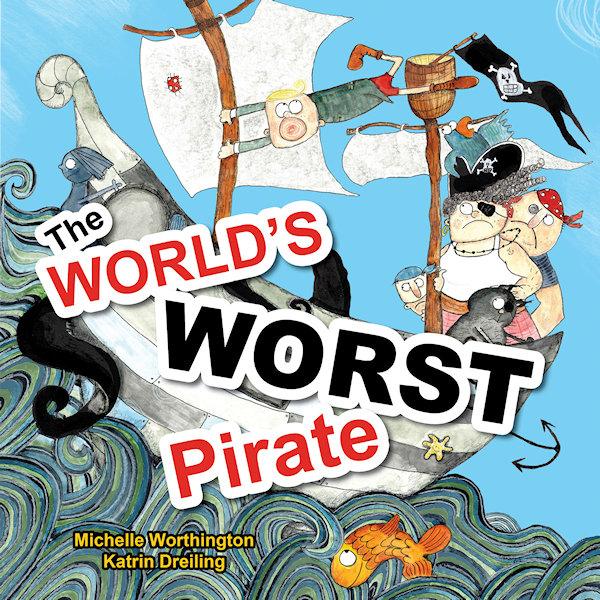
Katrin Dreiling went from language teacher to illustrator and received prestigious recognition for her picture book illustrations in “The World’s Worst Pirate”. This book, written by Michelle Worthington and published by Little Pink Dog Books, has been awarded Notable Book of 2018 by Children’s Book Council of Australia.
Willkommen! Welcome!
It’s wonderful to have you here, Katrin, I love your beautiful art techniques and I’m excited to learn about your journey as a children’s book illustrator. First, here’s a sneak peek at this special pirate story:
William is The World’s Worst Pirate so does that suggest he’s rude and nasty? Read on…
“Pirates are swashbuckling, treasure hunting, buccaneers of the seven seas. But if your mother is the Pirate Captain and you can’t stand on deck without getting seasick … that makes William The World’s Worst Pirate.” However, young William does have a special talent. Can he use it when the ship is under attack? Save the day, me hearty!
Q&A illustrator background
Katrin Dreiling, originally from Germany, loves to come up with quirky creations that inspire children to get creative. She enjoys giving colourful and messy art classes and says “Children are the true perfect grown-ups. Their hearts and minds are pure and good and it is important to nurture this – I strive to do that with art.” On the studious side, she provided the characters for animated University lectures and Government staff coaching videos that attracted over 320,000 views worldwide. In her free time, Katrin relaxes with her husband, three children and their Golden Retriever.
Q1. What is your favourite part of “The World’s Worst Pirate”?
Thank you, Gretchen, for this interview! My favourite part text-wise is when the Kraken attacks and everyone is supposed to run for their lives. Then there is a silence and Will quietly throws a cupcake to tame the beast. I like the contrast between noise and quietness and that it is such a peaceful, gentle approach. In terms of illustrations I think I like the cover the best. I just really enjoyed doing those ocean waves.
Q2. Of all your creations, who is your best loved character so far?
That would be Anton the Pig. This character has been in the works for a while now and so I really got used to him being around. He is also very sweet-hearted and funny and reminds me of a certain someone…
Q3. Where did the inspiration for this character come from?
Anton and his world are certainly inspired by my German background. The region I grew up in is known for their excessive bicycle riding because it’s very flat. So Anton is a passionate cyclist but I merged the landscape with a lot of ideas I picked up while living in Brisbane, Queensland. The inspiration for Anton’s story, though, came from years of working with children at school and my own three kids.
Q4. How would you describe your creative process on an average day?
My working day usually starts with a good walk with my Goldi to keep him happy and clear my head. Then I usually work down a list of things I have to do for my illustrating business. Once this is done I start creating. This can include simple sketching, commission work or extending my portfolio.
Q5. Do you like working in a group or home-office environment?
I am very happy to work by myself from home but I do seek professional input from other industry professionals on a regular basis. There is the Brisbane Illustrators Group where I made many good friends, WriteLinks and our local SCBWI group. I think it is very important to stay connected in which ever way you prefer, be that online or in real life.
In costume The World’s Worst Pirate book launch
Q6. Was it enjoyable working with writer Michelle Worthington?
Absolutely loved working withMichelle Worthington and would always choose to do so again. She is professional, smart and supportive and I felt very appreciated in my illustrating.
Q7. What is it like collaborating with an editor and publisher?
In the case of Little Pink Dog Books it was the perfect synergy between author, publisher and illustrator. Kathy and Peter Creamer were very inspired to keep this project a creative process which involved everyone in the same measure, and I believe the result reflects this very well. When I worked with other publishers it was a different, yet also enjoyable experience. I had to meet more firm requirements and learned new things along the way. I think you have to be adaptable as an illustrator in order to deliver the best possible outcome for the project.
Q8. Do you like to work with artistic freedom or a strict deadline?
I can do both 😊
Q9. Have you stayed up past midnight to finish an assignment?
Yes. I have worked through nights but if the work does not feel like work it is not a problem.
Q10. Have you ever received harsh criticism for your work?
I have been very lucky so far and mostly received constructive criticism which I value a lot. It’s easy to get too complacent and lose distance to your work. This is why I regularly book in for portfolio assessments with editors to get a fresh perspective on my work.
Q11. What is your favourite medium to work with and why?
I mix a lot of media together because I enjoy many things at the same time. I seem to always come back to ink in some form, though.
Q12. What colour would you be if you were an extra pencil in the box?
Black.
Q13. What are your thoughts on hand-painted vs computer generated artwork?
It works really well TOGETHER if you know how to.
Q14. Who are your favourite artists and have they influenced you?
Absolutely adore the work of Beatrice Alemagna. She has inspired me to go my own way, like she did. Then there is the quirky and unconventional style of Russell Ayto that I love. I think both artists truly work to delight and inspire children.
Q15. Are you involved in teaching workshops for children?
Yes, I will be giving workshops with Michelle Worthington to children at selected libraries in Brisbane during school holidays in July 2018. Also I give workshops for both children and grown-ups at a bookstore in Red Hill, Brisbane, as well as giving regular extra-curricular art classes once a week at New Farm State School.
Q16. Do you have a special creative goal for this year or is it a secret?
For my Anton the Pig story, I’d like to finish the manuscript and illustrations completely. Also getting published by one of the ‘big’ publishing houses has always been my dream and I’m still working towards this goal.
And this Q&A draws to a close
My sincere thanks, Katrin, for your personal insights into the world of picture book illustrating. I am sure you will reach your goal and I look forward to reading all about Anton!
Hey, is anyone else left wondering who that 'certain someone' is and why Katrin would be a black pencil...
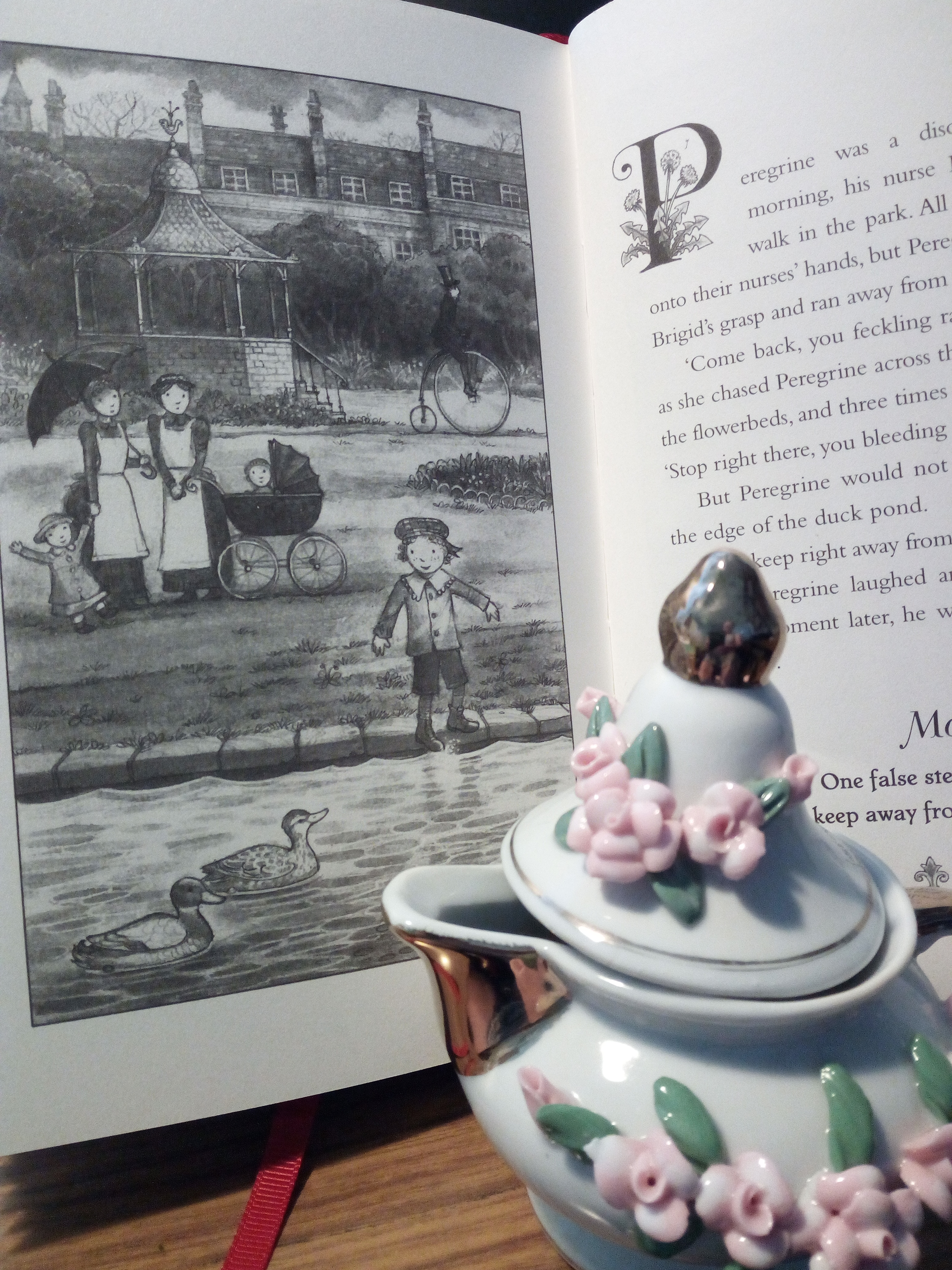
With a knowing smile, this Victorian-style book of manners is reminiscent of the period of parenting when misbehaving children were given orders and told dire consequences would ensue if they did not obey. Despite warnings, when a child in this book ignores an instruction, there is an aftermath of great magnitude.
Page 28 “Jesephany and Keziah were unruly and wild…”
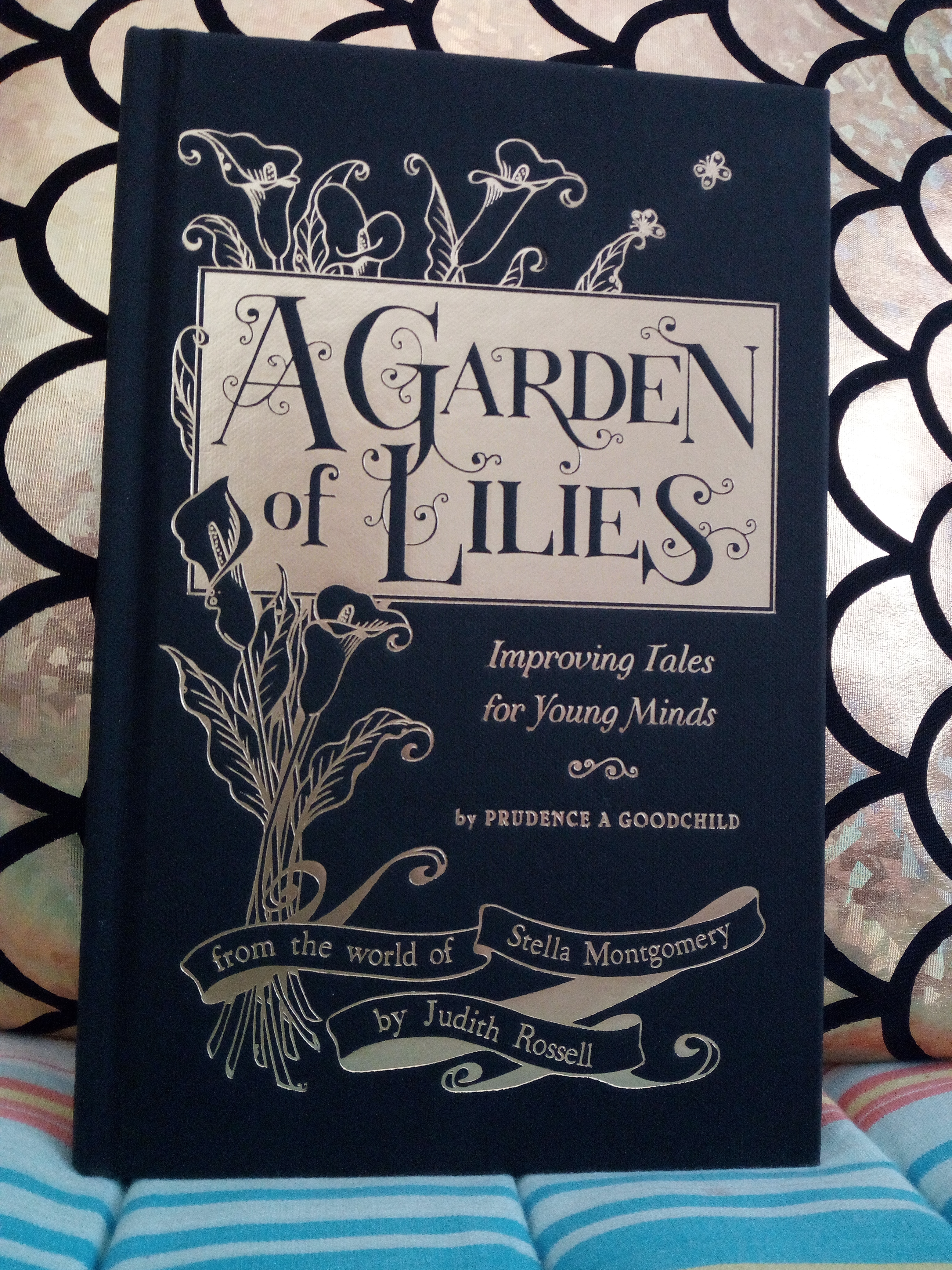
In “A Garden of Lilies: Improving Tales for Young Minds – by Prudence A Goodchild” children’s author and illustrator Judith Rossell has produced an atmospherically illustrated and tightly written volume. She has also mastered the art of a left-right jab, hitting with swift endings which leave the reader breathless.
Each punchy short story closes with a judicious moral. For example, Isadora daydreamed too much during her chores. One day she daydreamed while idly brushing her hair. Let’s just say she didn’t get to finish the task. “Moral: For hair that’s glossy, clean and bright, Two hundred strokes, both morn and night”.
After Isadora’s tale, there is what appears to be a lovely page entitled “Care of the Hair” with a recipe for making Soft Soap which “…will improve both the texture and colour of the hair” until things get a bit nauseating. Apart from kitchen scraps, the mixture must boil for hours until it forms a clear, thick jelly.
“A Garden of Lilies: Improving Tales for Young Minds” by Prudence A Goodchild (author Judith Rossell) ABC Books Australia
Basically the stories are about kids being kids and the 21st century reader should see the endings for what they are – a sample of Victorian etiquette and psychology which we would not dream of using on children today. Right? Okay, explain that to your child and laugh.
This slim book is approximately sixty pages (with attractive binding and colour plates) and scattered throughout are “Interesting Facts” and helpful hints like An Economical Recipe for a Plain Cake, A Useful Compass, Parlour Games and my personal favourite, An Album of Sea-Weeds. I will work on drying and pressing seaweed during my next holiday! Hmm, would seaweed smell like that starfish I once brought home?
In closing, I will give a shout-out to Mr Lindon of Woolloongabba, Queensland (Page 45) who grew a giant marrow. I think he must have read the book’s suggestion To Grow a Giant Marrow which signifies “A Garden of Lilies” is indeed a versatile volume!
I cannot give you a childproof safety rating but I think it is suitable for a sliding age scale and my own rating is 5-star.
♥Gretchen Bernet-Ward
Judith Rossell — Biography
Judith Rossell is the multi-award-winning author-illustrator of the bestselling Stella Montgomery series (Withering-by-Sea, Wormwood Mire, A Garden of Lilies and forthcoming Wakestone Hall). Judith has written thirteen books and illustrated more than eighty, and her work has been published in UK, US, Germany and translated into more than twenty languages. Before beginning her career in children’s books, Judith worked as a government scientist (not a mad scientist, a normal kind of scientist) and also for a cotton-spinning company (which made threads for T-shirts, denim jeans, mops and teabag strings). Judith lives in Melbourne, Australia with a cat the size of a walrus.
ACCLAIM FOR WITHERING-BY-SEA AND WORMWOOD MIRE:
Indie Awards – Winner 2015, Shortlisted 2017
Australian Book Industry Awards – Winner 2015, Shortlisted 2017
CBCA Awards – Honour Book 2015, Notable Book 2017
Davitt Awards – Winner 2015, Shortlisted 2017
Prime Minister’s Literary Awards – Shortlisted 2015
ABA Booksellers’ Choice Awards – Shortlisted 2017
Australian Book Design Awards – Shortlisted 2017
Aurealis Awards – Shortlisted 2015
Can you tell a book by its cover? Sure you can! Just the same as an individual’s personality and clothing can tell something about them, a book lures the reader with an enticing cover image. That visual reveal, a hint of what’s hidden within the book is a very important marketing tool.
A contemporary bookcover, no matter what the genre or category, has to be identifiable. It has to look good on publicity material, it has to create a mood and it has to appeal to its target audience. The font style, back cover blurb and all-important artwork join together to get you interested enough to part with your money. Unless you are borrowing the book from your local library. Nevertheless, you will still be interested in that lurid hardback in your hand because it promises so much…just look at that out-of-context quote from a famous author who said “chilling depth” and “sizzling romance” from a “writer with imagination”.
Millions of modern eye-catching bookcovers are perfectly serviceable and practicable and sensible and don’t mislead the intended reader. It can be argued that bookcover images only hint at a small portion of the entire book. But, as a person who reads books very closely, I disagree. I like to make my own assumptions and not be misled by skewed artistry.
Thus I start my LONG bookcover show-and-tell, documenting that which has annoyed me for some time – the all-to-obvious artwork on bookcovers, those illustrations which give the game away.
The reveal: I loathe it when the crime bookcover shows the pivotal moment in the book. A dead giveaway! Is that the graphic artist’s fault for reading the front and back page? Is it the publisher’s fault for handing out the last chapter?
Bookcover clue giveaway: I have just finished a police procedural and the creepy black-and-white cover photo with a rundown house on the hill encircled by barbed wire is actually where the bodies are buried. No kidding, I knew every time the detective went up that hill, he was darn stupid. Or the one with the sketch of a child on a rocking horse holding a scythe over her shoulder – storyline crumbles before it starts. Worth mentioning that a rocking horse was not even in the story.
Vignettes snipped from a chapter: Like historical fiction “Golden Hill”, where a sketch of the hero is seen on the bookcover leaping across a roof top in true Hollywood style, no doubt aimed at action-loving readers, when the bulk of the story revolves around cruel social hierarchy.
A mystery novel: Well, murder actually because several people end up getting killed. This illustration managed to ruin the first three punchlines in the first three chapters. Not to mention the good guy is seen working in the downstairs office window when his office is upstairs. Plus the red motorbike heading up the road outside is meant to be him, at the same time. Lovely drawing but couldn’t they have chosen something more accurate?
Overcooked Clones: There’s the hand frozen in ice (guess how the victim dies) there’s the bridge across the river (guess how the victim dies) there’s the threat (a big dark old building) there’s a corrupt political serial killer millionaire mowing his way through rich widowed neurotic socialites on board his yacht (guess how the victims die) or bones poking out of the earth…black crow…wolf in snow…lonely highway…stark tree…dropped gun…body part…the train racing through the underground station…all overdone crime tropes.
To quote Tim Kreider, essayist: “The main principles of design—in books…is your product must be bold and eye-catching and conspicuously different from everyone else’s, but not too much! Which is why the covers of most contemporary books all look disturbingly the same, as if inbred.” Which leads into––
Dark silhouette: I, for one, thoroughly dislike the brooding male or female silhouette in a heavy coat, head down, walking toward a menacing city skyline/bridge on a rain-soaked evening. Boring! The stock standard photo silhouette has been on countless bookcovers for years. Think of Lee Child.
Expected bookcovers or Clone II: Why does (1) Romance have the obligatory well-developed over-muscled man and well-developed bust-overflowing woman, and (2) Literary fiction has a sedate, toned, almost elegant layout with a design which purrs good taste? (3) Non-fiction is so varied it usually has just a colour photo with a word overlay. (4) Historical fiction will have a woman in period costume gazing at house or hillside. (5) Children’s books, fantasy and science fiction have a place all their own. Renegades breaking up the predictable.
Flip side: An irrelevant illustration. There are obscure bookcovers like “The Midnight Promise” with two hands shaking as though in agreement when the Promise is nothing like that image. At least it gave me something to ponder.
World-wide: I’m commenting on English language publications and referring to p-books and e-books. I’ve mentioned arbitrary books I have read and tried not to name them. However, the same book published in different countries gets a different bookcover. This is where designers and image stock can become tricksy. I have seen translated children’s books looking very adult, young adult books looking too adult, and adult books looking sugary sweet, e.g. cosy mystery covers with blood-thirsty content between the pages.
BONUS: Terry Pratchett’s bookcovers by artists Josh Kirby and Paul Kidby tell a detailed story. With fiction, decide how closely you should look. Decide if you want to undermine the plot. You may not even notice pictorial clues! Ask yourself if you are exercising your own freewill, or are you conditioned by a generic bookcover image.
Today, the mass market book illustrators, the image makers, appear to acquire design inspiration from their clinical, perfectly sculptured computer programs. Perhaps they should visit an art gallery, or see what’s shakin’ in the real world, then tell that miserable silhouette model to get lost.
Never stop reading!
♥Gretchen Bernet-Ward
Postscript : A Tiny Bit of History : Literature has changed in more ways than one over the centuries. Illuminated manuscripts gave way to smaller volumes with dust covers/jackets in 1820s Regency, then refined in 1920s to make hardback books more attractive. Before this the majority of bookcovers were a plain single colour with gold embossed wording and little adornment. Swanky ones did have lithographs or a portrait frontispiece. It is considered that 1930s paperback printing changed the course of bookcover art.
Walking in a park, I saw this wall of trompe l’oeil on the side of a public convenience block and just had to photograph it. The illusion, the trick of the eye was something special which I appreciated more after I saw my photograph. It was painted by local Sherwood (Brisbane) artists with the name Half Dozen Group of Artists Inc.
One of my favourite pastimes is to change my screensaver image. I do it on my PC and iPad regularly. Silly obsession, I know, but it gives me a smile when I log on each day. I take my own photographs wherever I might be, and have a supply of snapshots and artwork amassed from family and friends over the years. Some work well, some don’t. “Framing and focus” was the old adage.
Searching
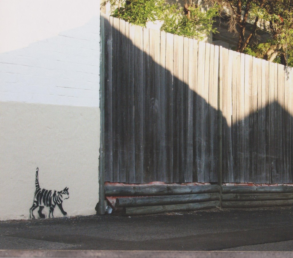
There is a children’s picture book entitled “The Stripey Street Cat” by Peter Warrington and Rachel Williams which is a photographic series of stencilled street art images of a stray cat. They tell the story of Stripey who is looking for a lost friend, meeting various other Newtown (Sydney) cats along the way.
An illustration I use regularly which attracts attention for all the wrong reasons is this one of Snoopy typing away in the middle of the night with a cigarette in his mouth. I’m anti-smoking but there’s something naughty about making an icon like Snoopy do such a thing. The artist is unknown but I think he’d have a good sense of humour.


 Jen, creator of Truly Tan series and other children’s books, says “I hope this post flips your lid. But only in a good way!”


 Henry is a boy who likes eating books. He absorbs knowledge as he happily munches his way to becoming the smartest boy on earth. Everything goes well until there’s an internal rebellion. Share Henry’s journey as he discovers something better than eating books.

 Q1. What is your favourite part of “The World’s Worst Pirate”?

 Q10. Have you ever received harsh criticism for your work?
 Q14. Who are your favourite artists and have they influenced you?
 Information: