After browsing the magazines at our local newsagent, I head for the greeting card section, well-stocked with original, colourful and varied cards, all shapes and sizes for all occasions.
My eye is always caught by a card which I think would suit the receiver. Even if there’s no occasion on the horizon, I’ll buy the greeting card so I’m prepared.
This bookcase artwork is my latest purchase which came with a shiny gold envelope – I love it so much I don’t think I’ll mail it to anyone!
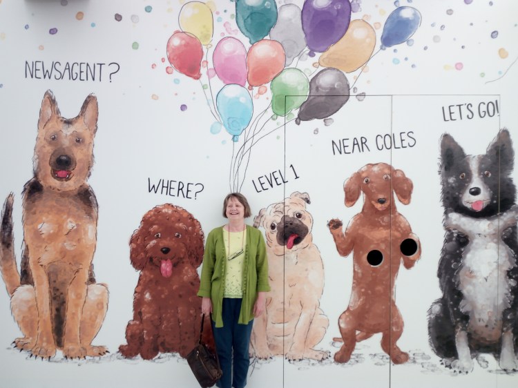
Another newsagent and stationery shop is undergoing renovations. The dog paintings make a nice change from blatant fashion store hoardings. Balloons or thought bubbles?
Remember when adult colouring between the lines was all the rage? Pages and pages of black and white sketches bound in bright covers which swept the world and swamped book retailers.
Themes were many and varied from new age, retro, zen, buildings, abstracts, swirls, flora and fauna, all cleverly pitched at adults without the 'adults only' content. It was certainly a fad and the biggest publishing push since Harry Potter hit the shelves.
The idea was that it should calm and relax anyone over 30 but it seemed to be a bigger hit with the over 60s especially those with grandchildren. In the library during craft time, youngsters would often wander off as one or two monopolists relived their kindergarten days with intense concentration. So, perhaps there was logic behind the publication frenzy.
In 2015, I was given the pocket-size publication ‘The Little Book of Calm Colouring – Portable Relaxation‘ which has beautiful quotes to accompany each drawing. I dug out a variety of pencils and doodled when the mood took me. I must admit that I can’t finish a full picture in one sitting so I return later to give it an abstract expressionist tweak here and there.
This kit travels with me on long weekends and the odd holiday but I’m not sure if I will ever complete the book. What I have completed was very enjoyable – here’s a small selection of my pencil handiwork.
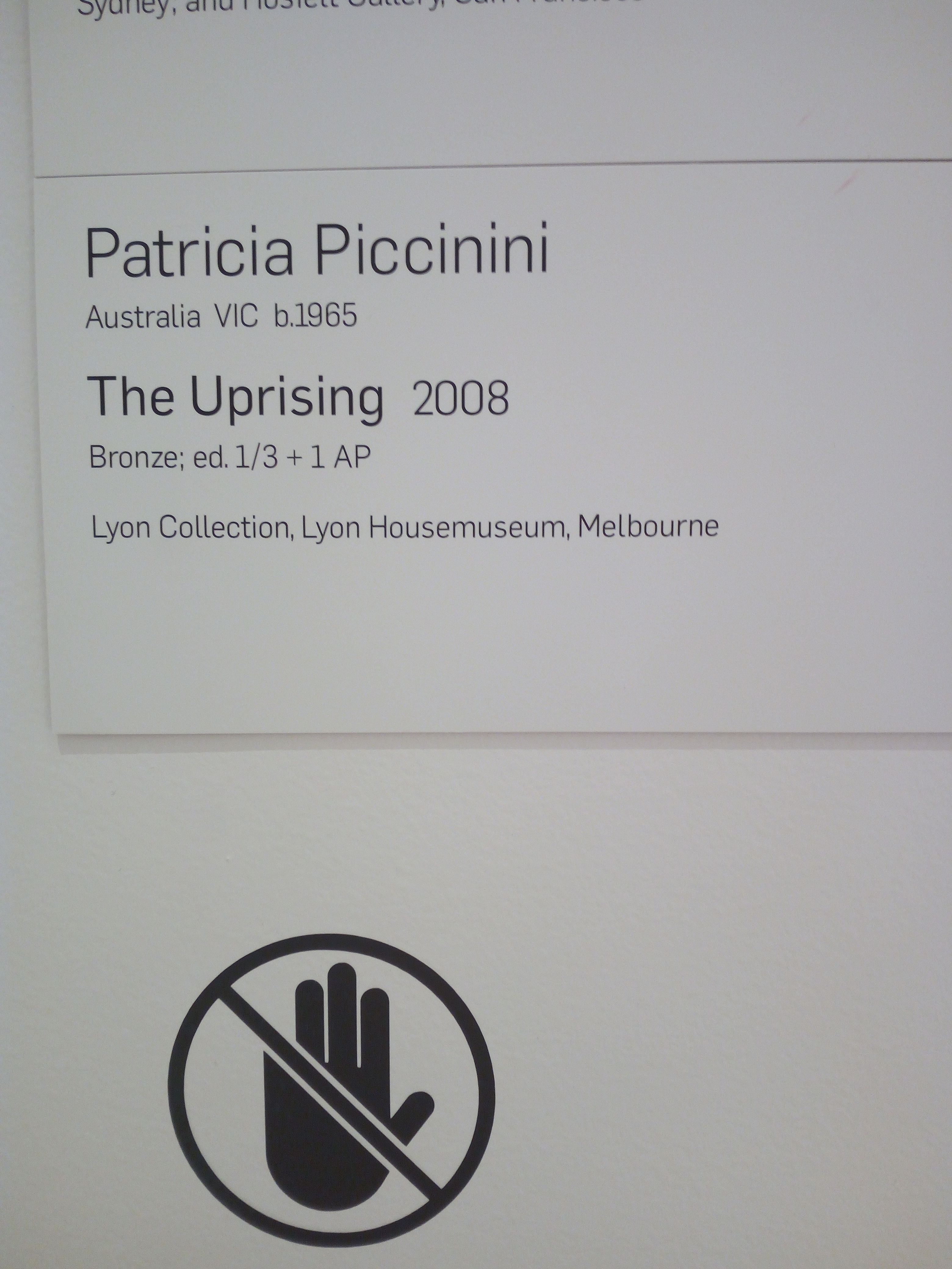
In her “Curious Affection” exhibition, world-renowned artist Patricia Piccinini and her DNA modified beings, credible and strangely familiar, invite us to find beauty in a transgenic social order not ruled by ideas of normality or perfection. I was hesitant about visiting this curious collection but enjoyed the experience.
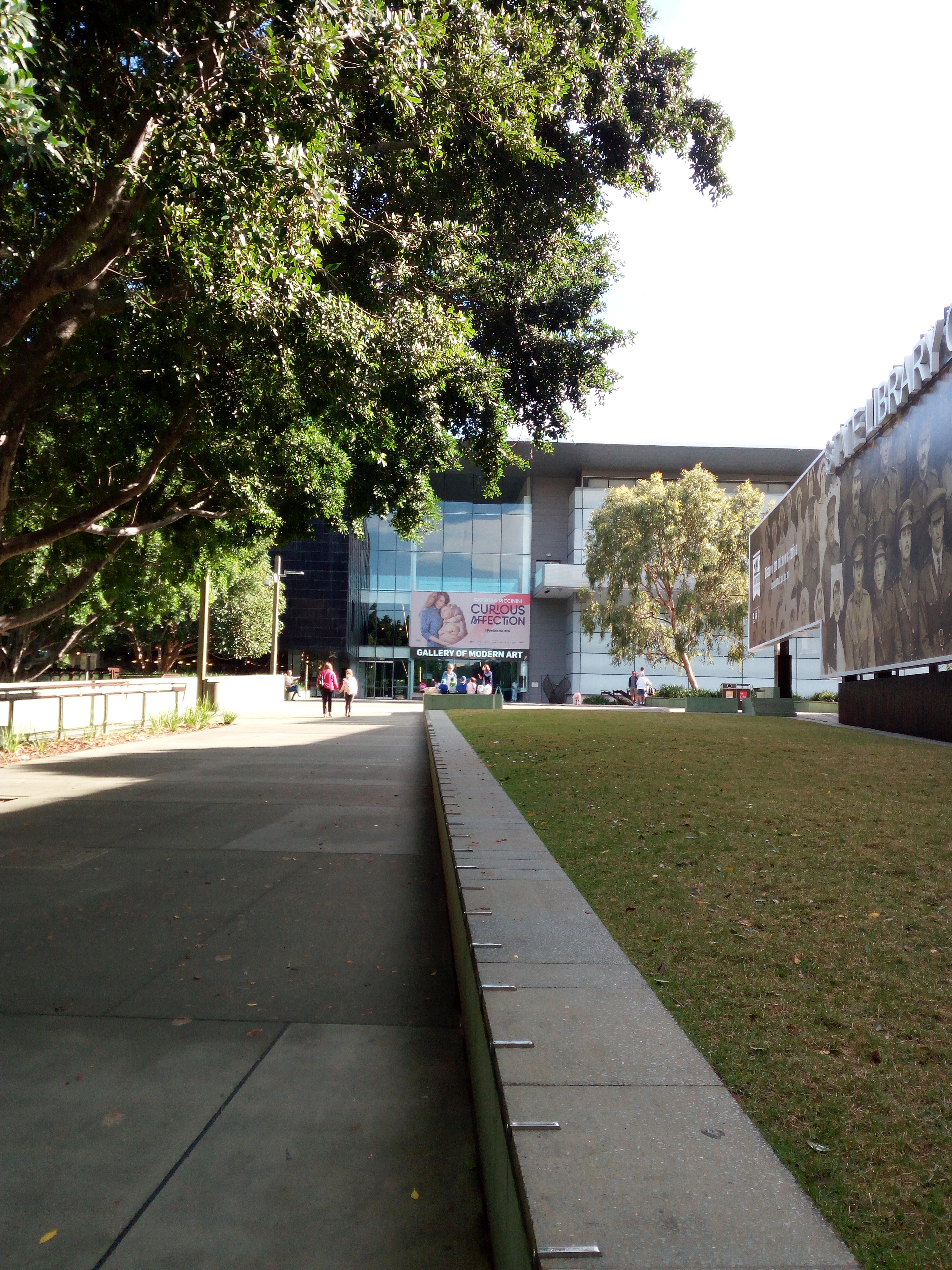
INTRODUCTION: On a grand scale, the creations of Patricia Piccinini occupy the entire ground floor of Gallery Of Modern Art, Brisbane Australia, with a retrospective of her most recognisable works from the past 20 years. It is Piccinini’s most ambitious solo exhibition to date, running from March to August 2018, with a collection of wall art and immersive multisensory installations – including new works like Heartwood (featured above) and a large-scale inflatable sculpture Pneutopia (not shown) exclusively conceived for the Gallery which rises effortlessly through an opening to the floor above.
* SOME VIEWERS MAY FIND THESE IMAGES DISTURBING *
TAP OR HOVER OVER IMAGES TO READ MY PICTORIAL COMMENTS. Of course, this doesn’t convey lighting or sound effects! My photographs are by no means exhaustive, there were many more art works and hybrid creations going about their daily lives.
The aluminum bus shelter at the start of my journey into the city.
A view of Brisbane city between Queensland Museum and State Library of Queensland, South Bank.
A pleasant walk to Gallery of Modern Art, South Bank.
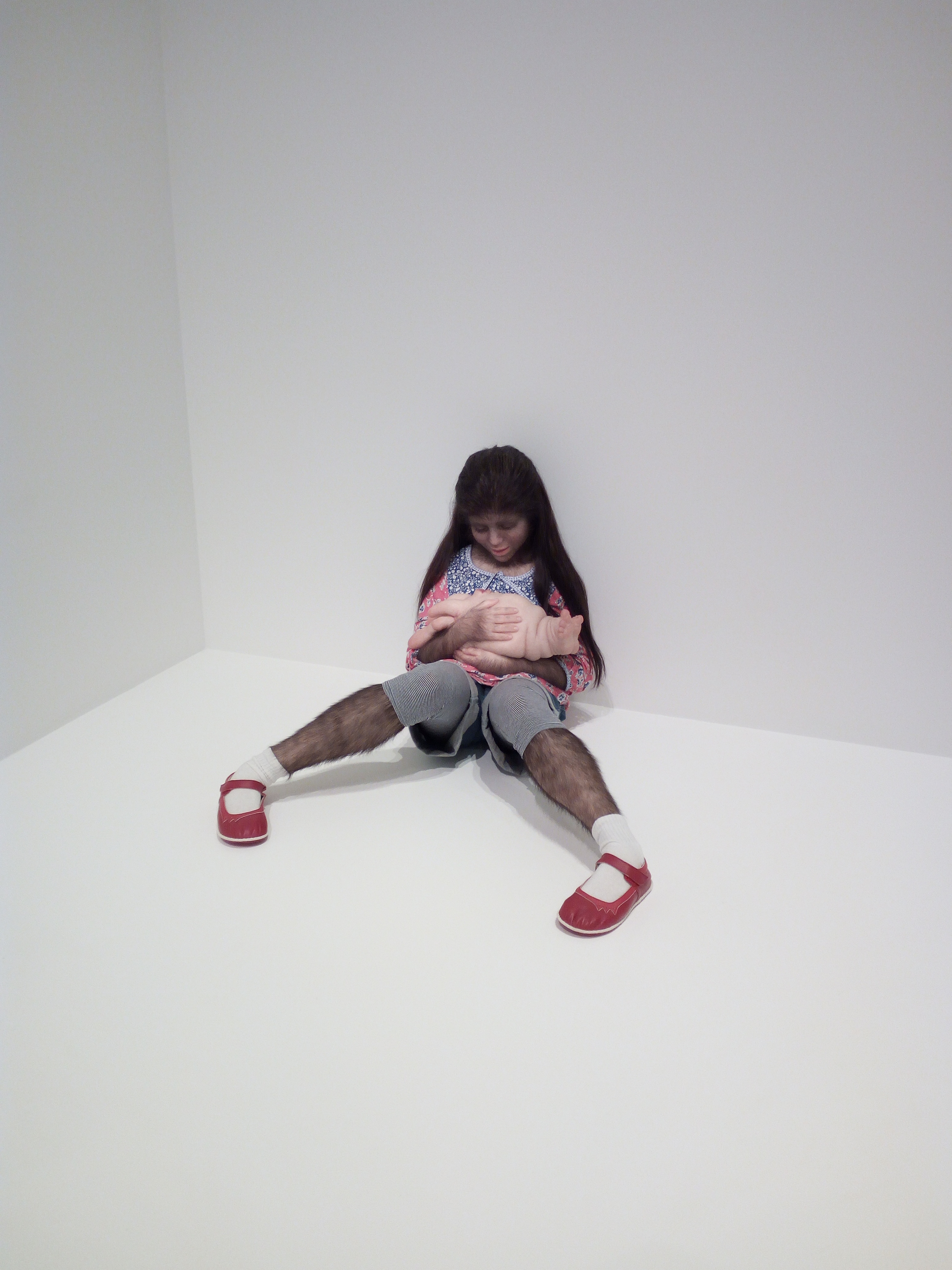
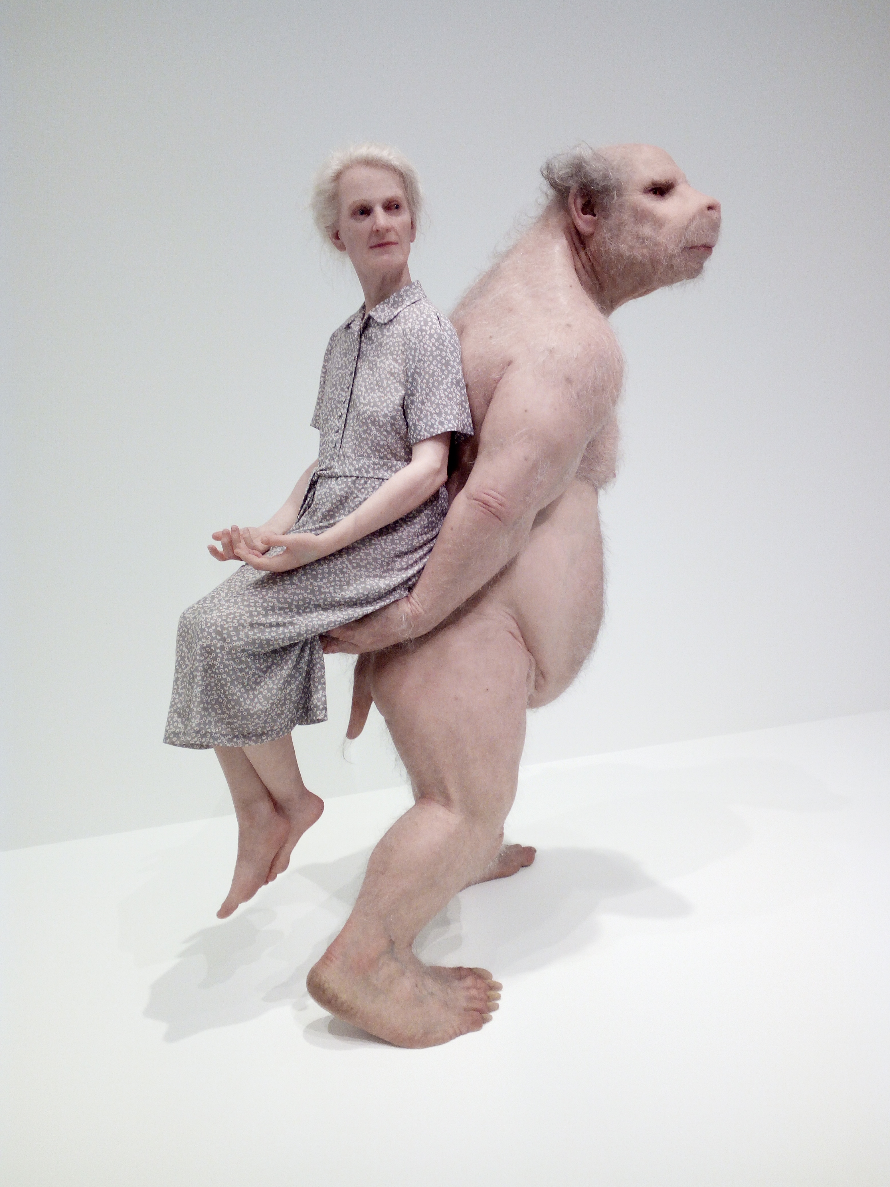
The girl exhibits a naturally occurring condition called Hypertrichosis, colloquially known as werewolf syndrome.
A friend, a playmate, the young child was happy to see him.
Big Mother is symbolic of earlier wet nurses who cared for infants.
The girl and her pet wallaby are doing yoga together.
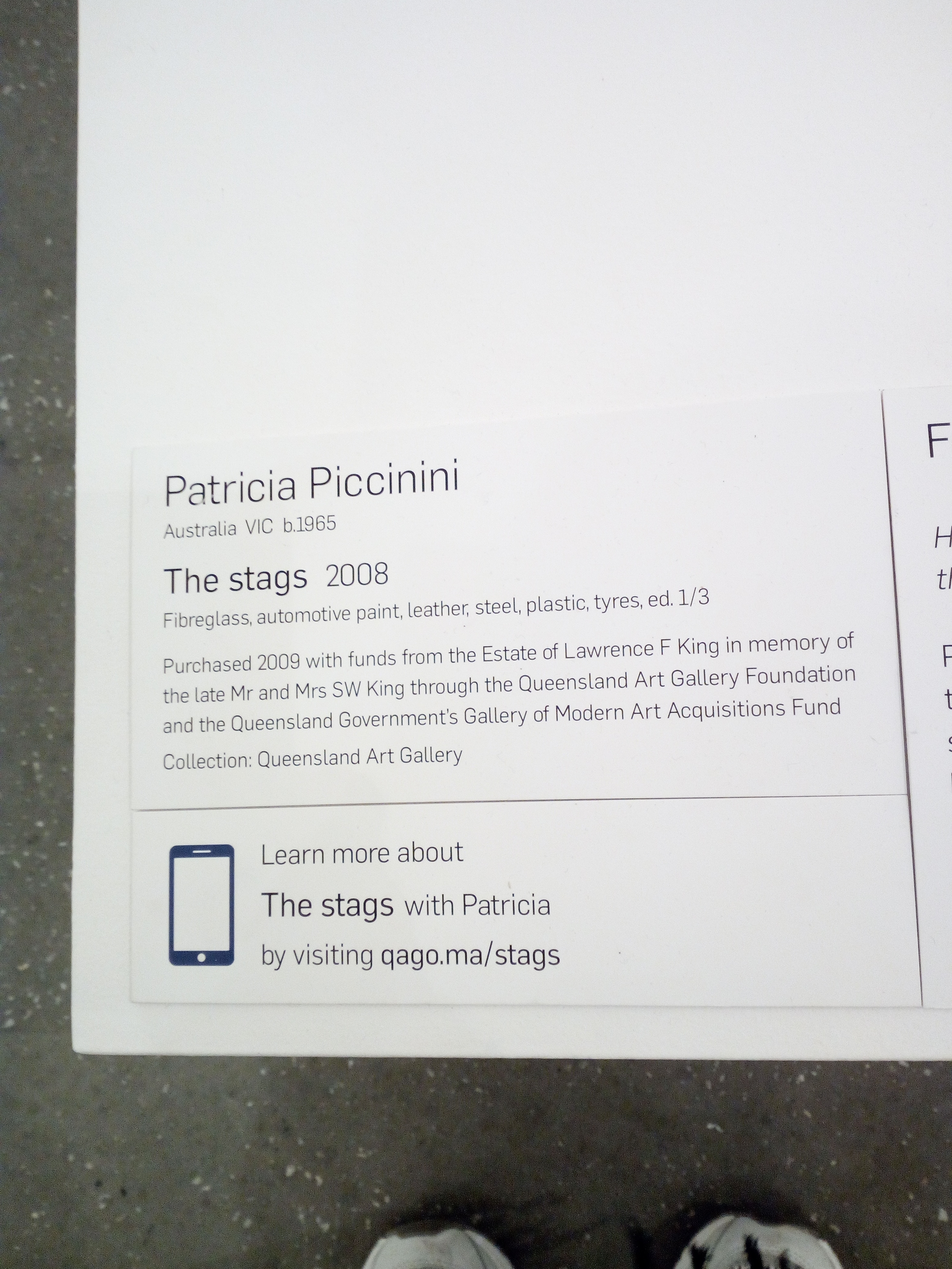
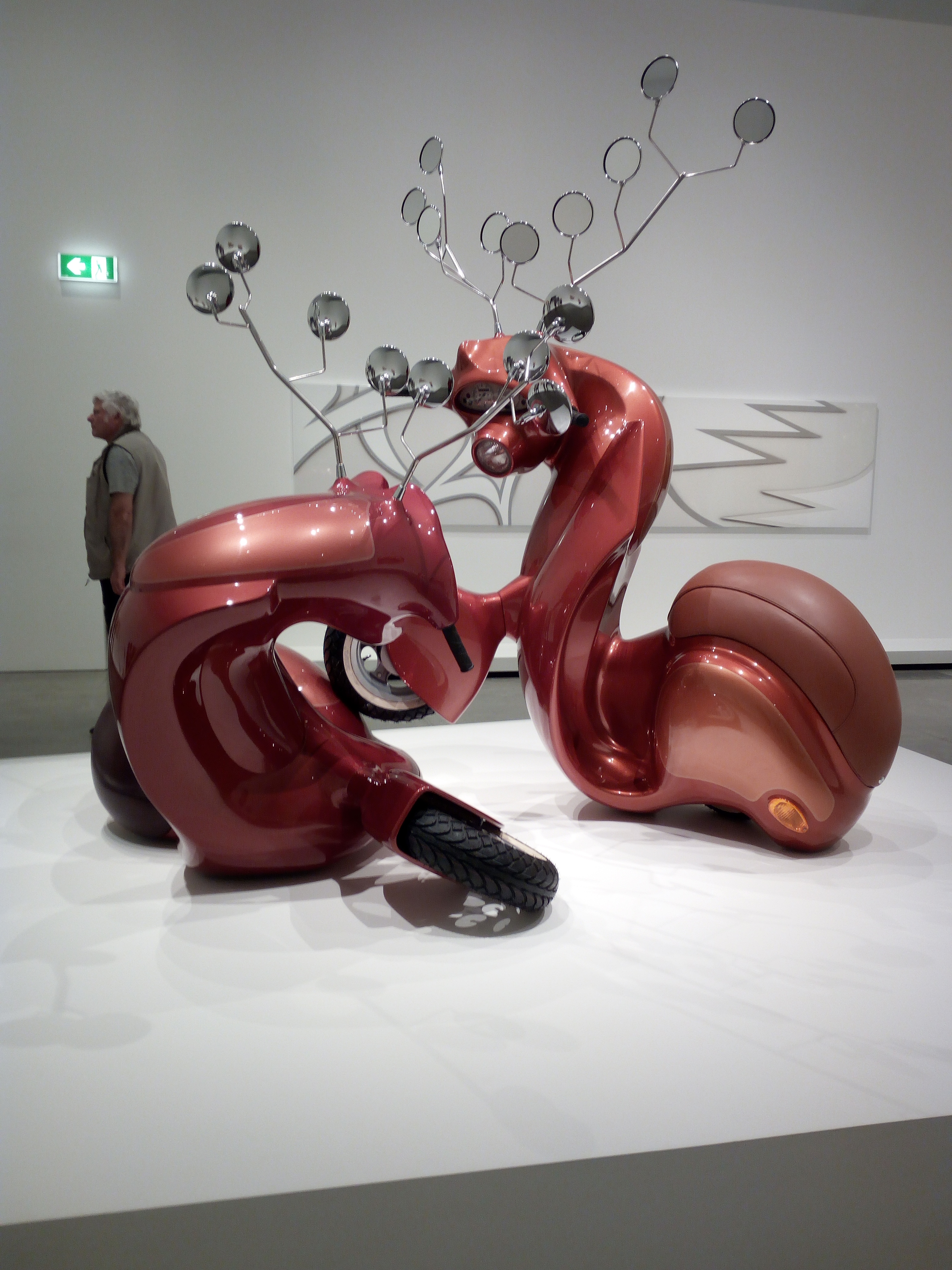
An automotive version of two stags fighting over their territory.
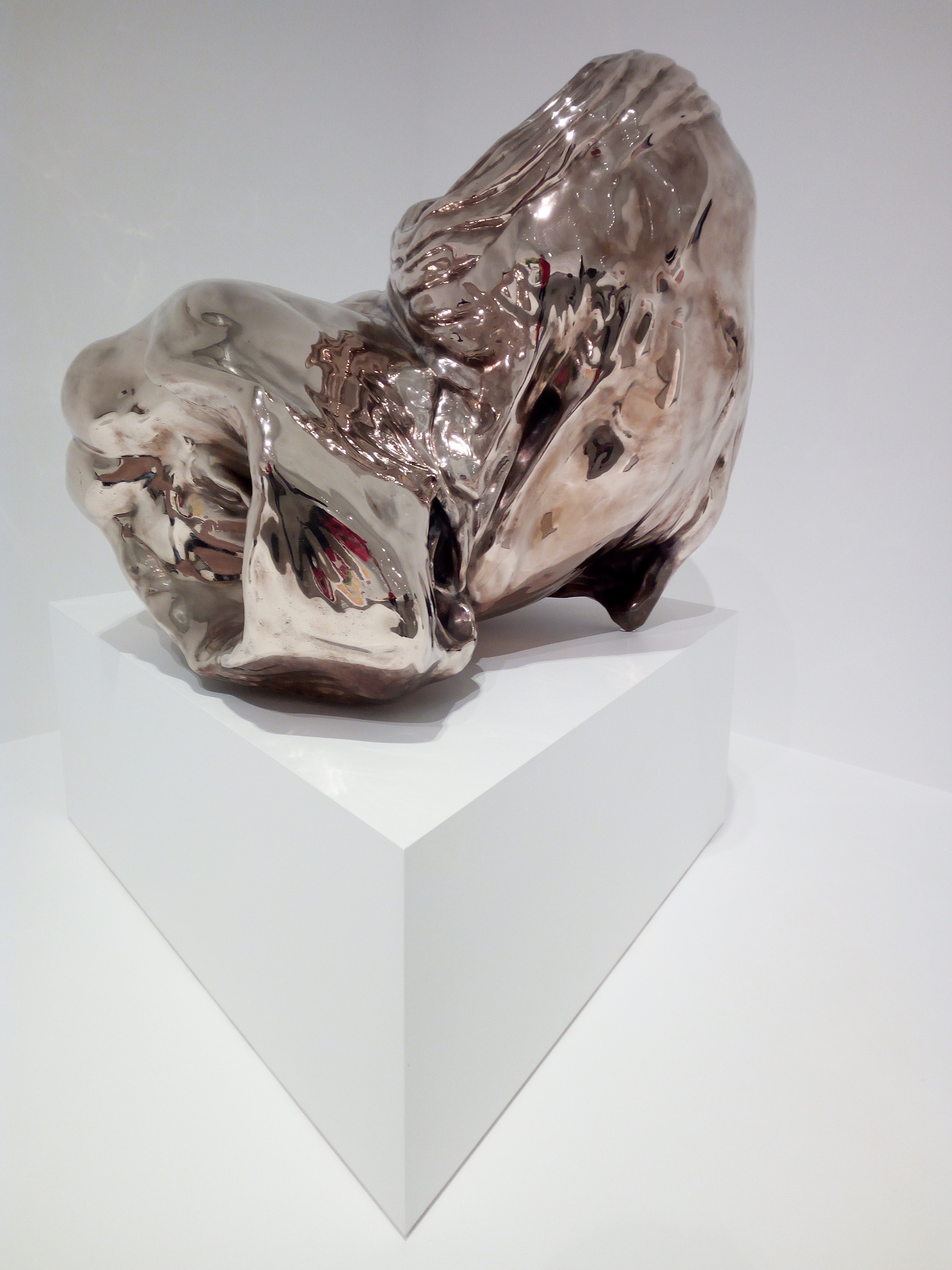
A fluid piece of bronze which may be titled A Deeply Held Breath 2009.
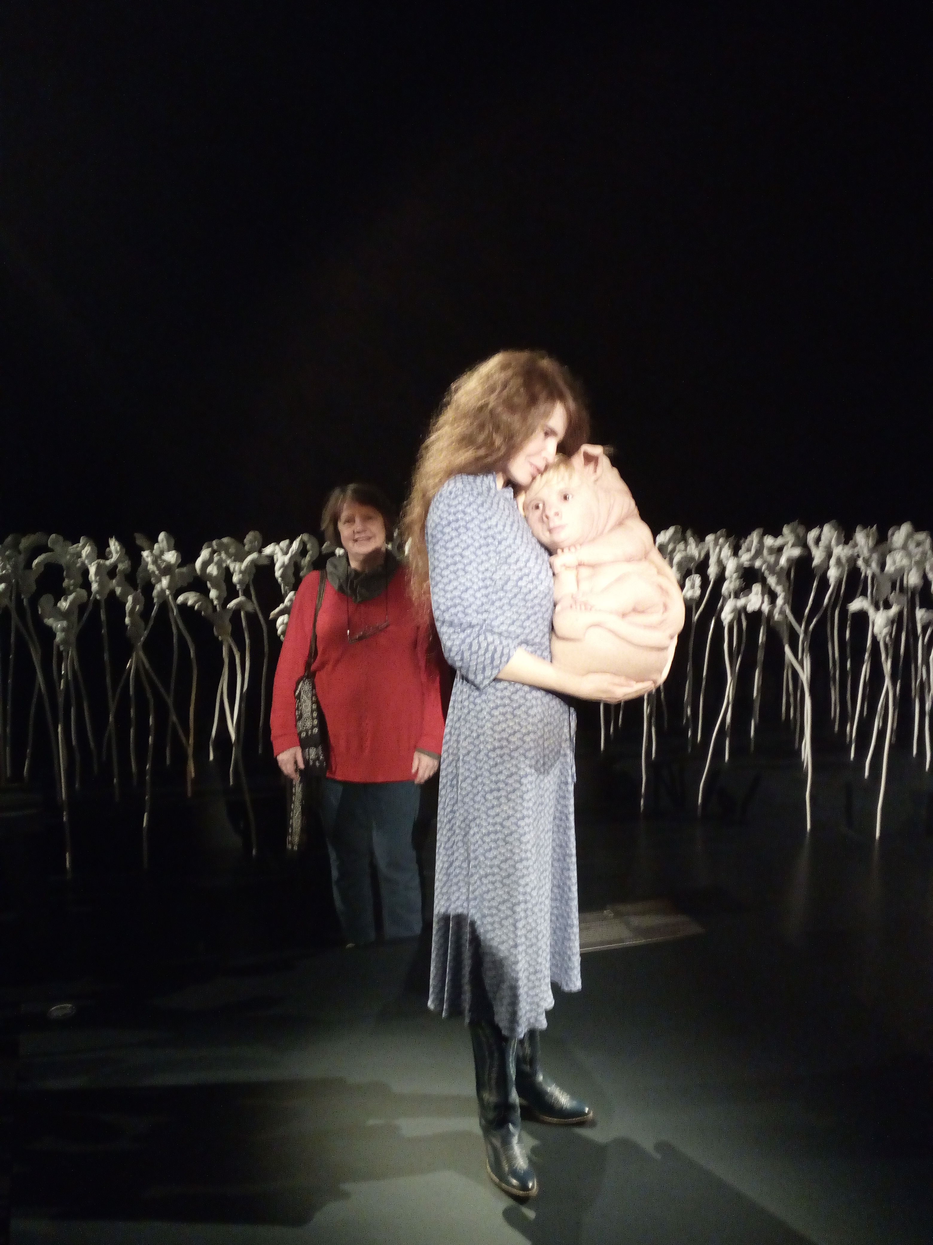
Patricia Piccinini standing in The Field with one of her curious affections and me lurking in the background.
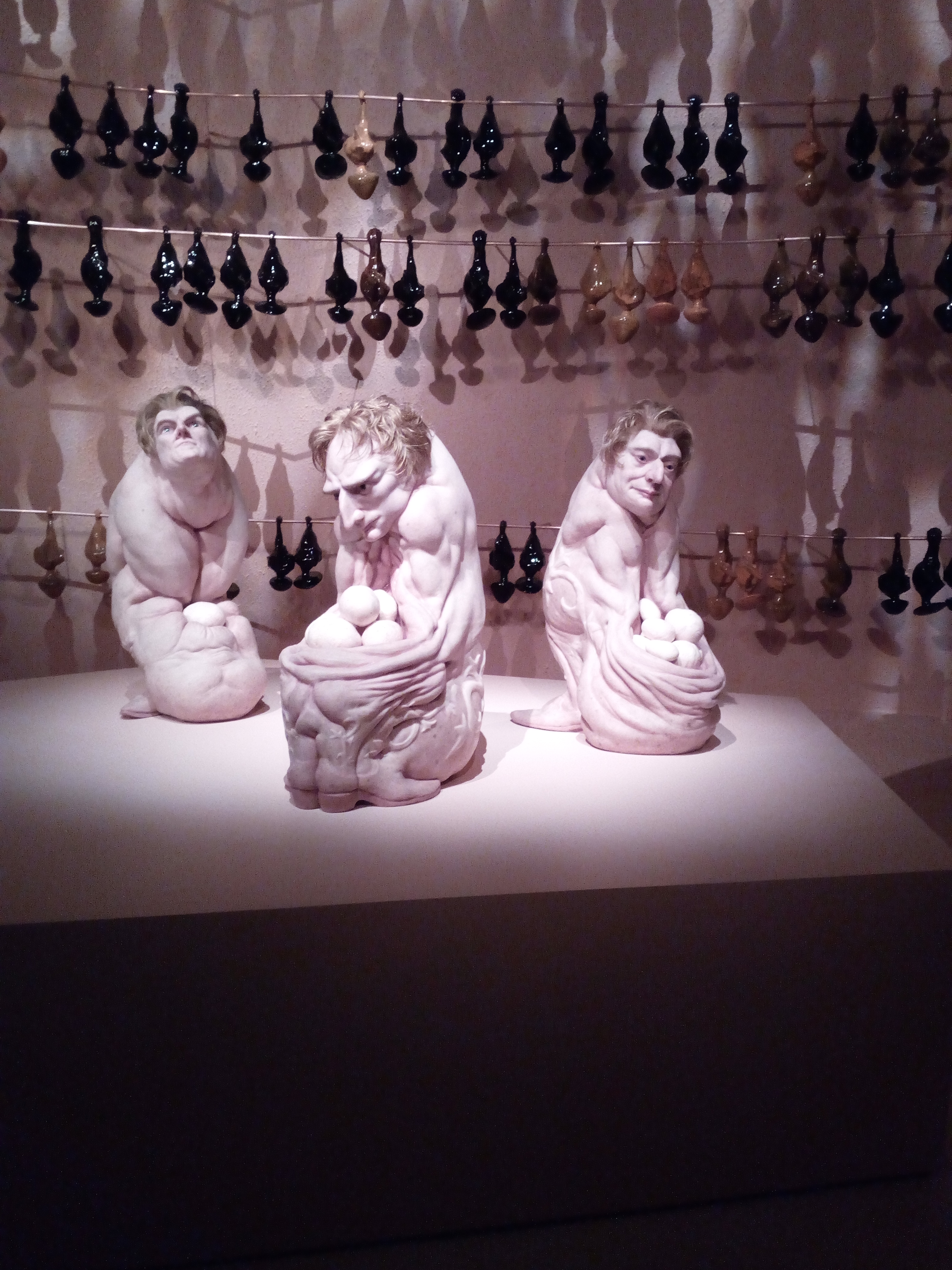
Three gentlemen incubating eggs while glossy ceramic bats hang around The Grotto.
Huge wall hanging made of ABS plastic and covered in automotive paint.
Of all the large and small genetically engineered sculptures, The Carrier was my favourite piece.
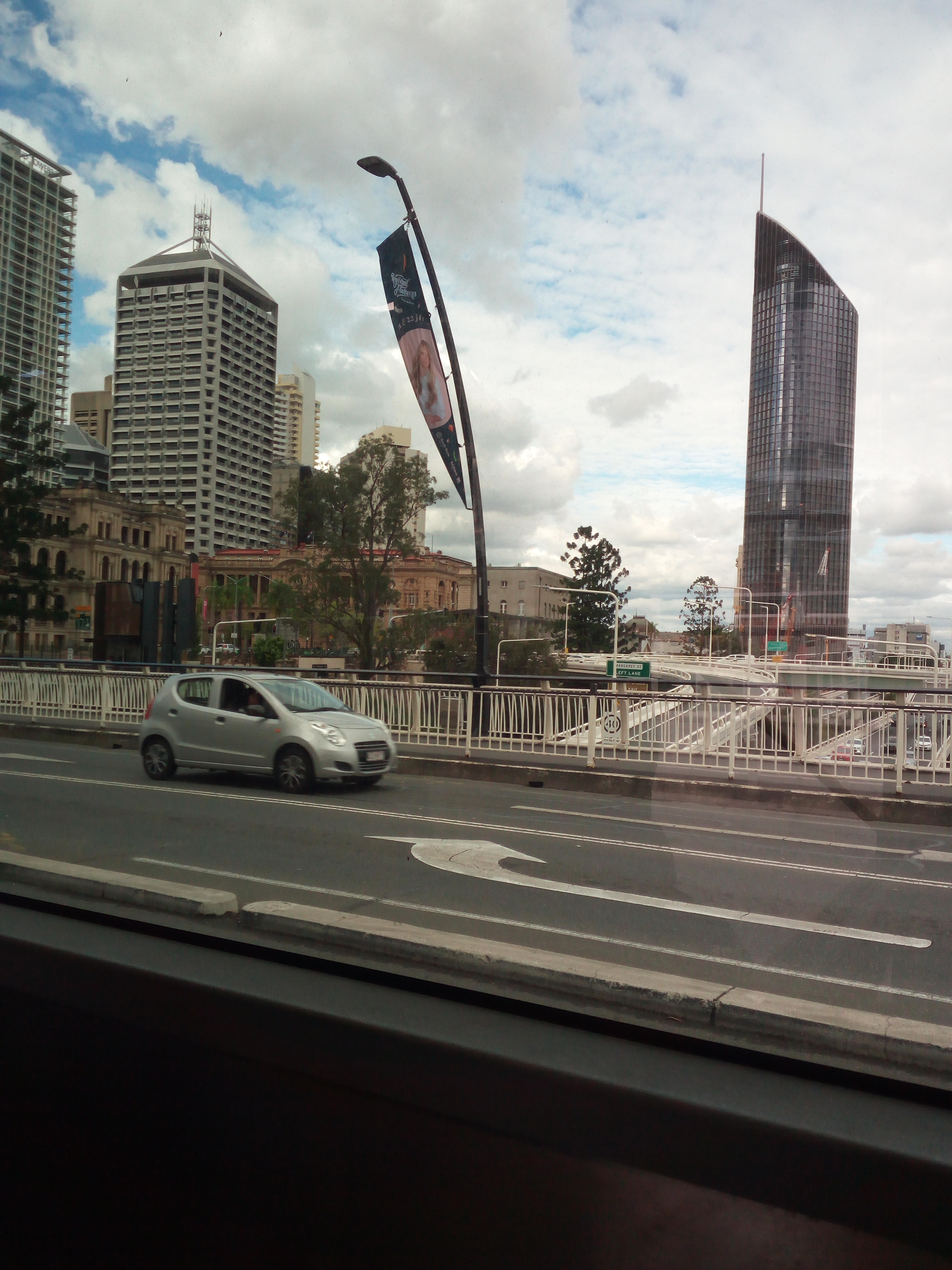
GOMA view across the Brisbane River (Maiwar) to the city.
GOMA view across the river and Kurilpa Bridge to the city.
The Bottom Feeder did not join us for lunch.
Crossing the Victoria Bridge on my bus journey home.
Our guide explained most models are made of silicone, fibreglass, polyurethane and human hair – for a deeper understanding, Patricia Piccinini has recorded video stories and GOMA blog shows the exhibition conception to completion.
CLOSING: Like most art, there is more to it than meets the eye. Patricia Piccinini’s works are complex. We are asked to think about our place in a world where advances in biotechnology, genetic engineering, organ harvesting and digital technologies are challenging the boundaries of humanity.
The more I learned about this exhibition, the more I understood the science, the pathos and the dangerous waters we may sail into one day, much the same as the internet was launched on a naïve world. With intelligence and compassion we may learn to create something new without destroying the old.
♥Gretchen Bernet-Ward
‘Curious Affection’ Patricia Piccinini GOMA 24 Mar-5 Aug 2018
Kindred sculpture is of a hybrid mother and her babies.
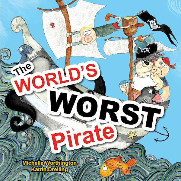
Katrin Dreiling went from language teacher to illustrator and received prestigious recognition for her picture book illustrations in “The World’s Worst Pirate”. This book, written by Michelle Worthington and published by Little Pink Dog Books, has been awarded Notable Book of 2018 by Children’s Book Council of Australia.
Willkommen! Welcome!
It’s wonderful to have you here, Katrin, I love your beautiful art techniques and I’m excited to learn about your journey as a children’s book illustrator. First, here’s a sneak peek at this special pirate story:
William is The World’s Worst Pirate so does that suggest he’s rude and nasty? Read on…
“Pirates are swashbuckling, treasure hunting, buccaneers of the seven seas. But if your mother is the Pirate Captain and you can’t stand on deck without getting seasick … that makes William The World’s Worst Pirate.” However, young William does have a special talent. Can he use it when the ship is under attack? Save the day, me hearty!
Q&A illustrator background
Katrin Dreiling, originally from Germany, loves to come up with quirky creations that inspire children to get creative. She enjoys giving colourful and messy art classes and says “Children are the true perfect grown-ups. Their hearts and minds are pure and good and it is important to nurture this – I strive to do that with art.” On the studious side, she provided the characters for animated University lectures and Government staff coaching videos that attracted over 320,000 views worldwide. In her free time, Katrin relaxes with her husband, three children and their Golden Retriever.
Q1. What is your favourite part of “The World’s Worst Pirate”?
Thank you, Gretchen, for this interview! My favourite part text-wise is when the Kraken attacks and everyone is supposed to run for their lives. Then there is a silence and Will quietly throws a cupcake to tame the beast. I like the contrast between noise and quietness and that it is such a peaceful, gentle approach. In terms of illustrations I think I like the cover the best. I just really enjoyed doing those ocean waves.
Q2. Of all your creations, who is your best loved character so far?
That would be Anton the Pig. This character has been in the works for a while now and so I really got used to him being around. He is also very sweet-hearted and funny and reminds me of a certain someone…
Q3. Where did the inspiration for this character come from?
Anton and his world are certainly inspired by my German background. The region I grew up in is known for their excessive bicycle riding because it’s very flat. So Anton is a passionate cyclist but I merged the landscape with a lot of ideas I picked up while living in Brisbane, Queensland. The inspiration for Anton’s story, though, came from years of working with children at school and my own three kids.
Q4. How would you describe your creative process on an average day?
My working day usually starts with a good walk with my Goldi to keep him happy and clear my head. Then I usually work down a list of things I have to do for my illustrating business. Once this is done I start creating. This can include simple sketching, commission work or extending my portfolio.
Q5. Do you like working in a group or home-office environment?
I am very happy to work by myself from home but I do seek professional input from other industry professionals on a regular basis. There is the Brisbane Illustrators Group where I made many good friends, WriteLinks and our local SCBWI group. I think it is very important to stay connected in which ever way you prefer, be that online or in real life.
In costume The World’s Worst Pirate book launch
Q6. Was it enjoyable working with writer Michelle Worthington?
Absolutely loved working withMichelle Worthington and would always choose to do so again. She is professional, smart and supportive and I felt very appreciated in my illustrating.
Q7. What is it like collaborating with an editor and publisher?
In the case of Little Pink Dog Books it was the perfect synergy between author, publisher and illustrator. Kathy and Peter Creamer were very inspired to keep this project a creative process which involved everyone in the same measure, and I believe the result reflects this very well. When I worked with other publishers it was a different, yet also enjoyable experience. I had to meet more firm requirements and learned new things along the way. I think you have to be adaptable as an illustrator in order to deliver the best possible outcome for the project.
Q8. Do you like to work with artistic freedom or a strict deadline?
I can do both 😊
Q9. Have you stayed up past midnight to finish an assignment?
Yes. I have worked through nights but if the work does not feel like work it is not a problem.
Q10. Have you ever received harsh criticism for your work?
I have been very lucky so far and mostly received constructive criticism which I value a lot. It’s easy to get too complacent and lose distance to your work. This is why I regularly book in for portfolio assessments with editors to get a fresh perspective on my work.
Q11. What is your favourite medium to work with and why?
I mix a lot of media together because I enjoy many things at the same time. I seem to always come back to ink in some form, though.
Q12. What colour would you be if you were an extra pencil in the box?
Black.
Q13. What are your thoughts on hand-painted vs computer generated artwork?
It works really well TOGETHER if you know how to.
Q14. Who are your favourite artists and have they influenced you?
Absolutely adore the work of Beatrice Alemagna. She has inspired me to go my own way, like she did. Then there is the quirky and unconventional style of Russell Ayto that I love. I think both artists truly work to delight and inspire children.
Q15. Are you involved in teaching workshops for children?
Yes, I will be giving workshops with Michelle Worthington to children at selected libraries in Brisbane during school holidays in July 2018. Also I give workshops for both children and grown-ups at a bookstore in Red Hill, Brisbane, as well as giving regular extra-curricular art classes once a week at New Farm State School.
Q16. Do you have a special creative goal for this year or is it a secret?
For my Anton the Pig story, I’d like to finish the manuscript and illustrations completely. Also getting published by one of the ‘big’ publishing houses has always been my dream and I’m still working towards this goal.
And this Q&A draws to a close
My sincere thanks, Katrin, for your personal insights into the world of picture book illustrating. I am sure you will reach your goal and I look forward to reading all about Anton!
Hey, is anyone else left wondering who that 'certain someone' is and why Katrin would be a black pencil...
I love the homey words and clean, familiar lines of Rachael Flynn’s artwork. She lives on a cattle and sheep farm in a locality called Piambong which is about 25km north-west of Mudgee, NSW, Australia. Her calendar (above) features rural farm life with a quirky theme and seasonal recipe each month.
Website http://www.redtractor.com.au/
Can you tell a book by its cover? Sure you can! Just the same as an individual’s personality and clothing can tell something about them, a book lures the reader with an enticing cover image. That visual reveal, a hint of what’s hidden within the book is a very important marketing tool.
A contemporary bookcover, no matter what the genre or category, has to be identifiable. It has to look good on publicity material, it has to create a mood and it has to appeal to its target audience. The font style, back cover blurb and all-important artwork join together to get you interested enough to part with your money. Unless you are borrowing the book from your local library. Nevertheless, you will still be interested in that lurid hardback in your hand because it promises so much…just look at that out-of-context quote from a famous author who said “chilling depth” and “sizzling romance” from a “writer with imagination”.
Millions of modern eye-catching bookcovers are perfectly serviceable and practicable and sensible and don’t mislead the intended reader. It can be argued that bookcover images only hint at a small portion of the entire book. But, as a person who reads books very closely, I disagree. I like to make my own assumptions and not be misled by skewed artistry.
Thus I start my LONG bookcover show-and-tell, documenting that which has annoyed me for some time – the all-to-obvious artwork on bookcovers, those illustrations which give the game away.
The reveal: I loathe it when the crime bookcover shows the pivotal moment in the book. A dead giveaway! Is that the graphic artist’s fault for reading the front and back page? Is it the publisher’s fault for handing out the last chapter?
Bookcover clue giveaway: I have just finished a police procedural and the creepy black-and-white cover photo with a rundown house on the hill encircled by barbed wire is actually where the bodies are buried. No kidding, I knew every time the detective went up that hill, he was darn stupid. Or the one with the sketch of a child on a rocking horse holding a scythe over her shoulder – storyline crumbles before it starts. Worth mentioning that a rocking horse was not even in the story.
Vignettes snipped from a chapter: Like historical fiction “Golden Hill”, where a sketch of the hero is seen on the bookcover leaping across a roof top in true Hollywood style, no doubt aimed at action-loving readers, when the bulk of the story revolves around cruel social hierarchy.
A mystery novel: Well, murder actually because several people end up getting killed. This illustration managed to ruin the first three punchlines in the first three chapters. Not to mention the good guy is seen working in the downstairs office window when his office is upstairs. Plus the red motorbike heading up the road outside is meant to be him, at the same time. Lovely drawing but couldn’t they have chosen something more accurate?
Overcooked Clones: There’s the hand frozen in ice (guess how the victim dies) there’s the bridge across the river (guess how the victim dies) there’s the threat (a big dark old building) there’s a corrupt political serial killer millionaire mowing his way through rich widowed neurotic socialites on board his yacht (guess how the victims die) or bones poking out of the earth…black crow…wolf in snow…lonely highway…stark tree…dropped gun…body part…the train racing through the underground station…all overdone crime tropes.
To quote Tim Kreider, essayist: “The main principles of design—in books…is your product must be bold and eye-catching and conspicuously different from everyone else’s, but not too much! Which is why the covers of most contemporary books all look disturbingly the same, as if inbred.” Which leads into––
Dark silhouette: I, for one, thoroughly dislike the brooding male or female silhouette in a heavy coat, head down, walking toward a menacing city skyline/bridge on a rain-soaked evening. Boring! The stock standard photo silhouette has been on countless bookcovers for years. Think of Lee Child.
Expected bookcovers or Clone II: Why does (1) Romance have the obligatory well-developed over-muscled man and well-developed bust-overflowing woman, and (2) Literary fiction has a sedate, toned, almost elegant layout with a design which purrs good taste? (3) Non-fiction is so varied it usually has just a colour photo with a word overlay. (4) Historical fiction will have a woman in period costume gazing at house or hillside. (5) Children’s books, fantasy and science fiction have a place all their own. Renegades breaking up the predictable.
Flip side: An irrelevant illustration. There are obscure bookcovers like “The Midnight Promise” with two hands shaking as though in agreement when the Promise is nothing like that image. At least it gave me something to ponder.
World-wide: I’m commenting on English language publications and referring to p-books and e-books. I’ve mentioned arbitrary books I have read and tried not to name them. However, the same book published in different countries gets a different bookcover. This is where designers and image stock can become tricksy. I have seen translated children’s books looking very adult, young adult books looking too adult, and adult books looking sugary sweet, e.g. cosy mystery covers with blood-thirsty content between the pages.
BONUS: Terry Pratchett’s bookcovers by artists Josh Kirby and Paul Kidby tell a detailed story. With fiction, decide how closely you should look. Decide if you want to undermine the plot. You may not even notice pictorial clues! Ask yourself if you are exercising your own freewill, or are you conditioned by a generic bookcover image.
Today, the mass market book illustrators, the image makers, appear to acquire design inspiration from their clinical, perfectly sculptured computer programs. Perhaps they should visit an art gallery, or see what’s shakin’ in the real world, then tell that miserable silhouette model to get lost.
Never stop reading!
♥Gretchen Bernet-Ward
Postscript : A Tiny Bit of History : Literature has changed in more ways than one over the centuries. Illuminated manuscripts gave way to smaller volumes with dust covers/jackets in 1820s Regency, then refined in 1920s to make hardback books more attractive. Before this the majority of bookcovers were a plain single colour with gold embossed wording and little adornment. Swanky ones did have lithographs or a portrait frontispiece. It is considered that 1930s paperback printing changed the course of bookcover art.
When I was a kid we used to say “Pinch and punch for the first of the month” and I don’t know why. A lot of our practical jokes involved physical actions which resulted in the receiver going “Ow, ouch” and glaring fiercely while rubbing their arm.
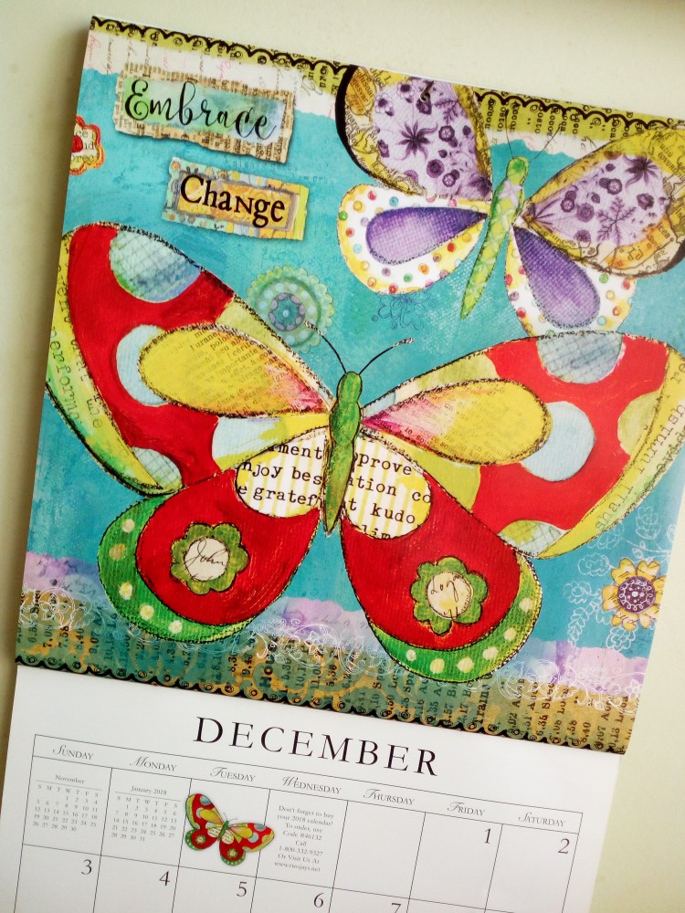
This beautiful calendar art was created by Sue Zipkin, produced by Hopper Studios, and I will be sad to see it go. However, its final words are encouraging “Embrace Change”. How many of us will actually do that next year?
“A year from now you will wish you had started today.” — Karen Lamb
Postcards are alive and well and received by countless friends, family and complete strangers around the world. Complete strangers? This is where Postcrossing comes into the picture.
I first learned about Postcrossing, a postcard exchange group, from a quarterly Stamp Bulletin and joined free-of-charge. The five-step guidelines are easy to follow, the website makes it simple to set up a profile and tweak your settings. Navigate around and check out the stunning and prolific cards received and uploaded by Postcrossing members. Everyone abides by the rules so things flow smoothly between more than 69,000 members in over 200 countries.
SEND: There’s pleasure in finding and choosing suitable postcards and stamps uniquely representative of your own location. Clever members can match a postcard to followers hobbies. It took a couple of weeks for the first postcard to hit my letterbox but I could start mailing out straight away.
RECEIVE: The beauty, variety and quantity I received, often from places I’d never heard of, was impressive. English is universal although you can specify countries and language. Handwritten, never laser printed, it takes a certain skill to describe something about yourself and your town on the back of a small piece of cardboard!
The Postcrossing project was created in 2005 by Postcrossing Founder Paulo Magalhães as a side project when he was a student in Portugal. From 2008 to 2017, 40 million postcards have been sent. Naturally Paulo loves to receive postcards and finding one in his mailbox always makes his day!
Right down to the different shapes of the stamps, and in some cases, distinctly long addresses, I was hooked on the fun.
The Postcrossing website has stats and charts to follow the progress of your postcards and I only had one go missing in action. I think the British postcards were the quickest to arrive and I’ll be diplomatic and not say which was the slowest. Larger countries sometimes lagged, perhaps because of sheer volume – or misguided postal cuts. In Australia, there’s an infinite variety of unique postage stamps and supply doesn’t look like declining any time soon.
This world-wide concept stands strong, despite the challenges of internet and social media. Stamps are still stuck on postcards, timeless messages are still written on the back, and they are still physically mailed to a real address.
Postcrossing friendships are possible via their blog, forum and meet-ups. Due to work commitments, I closed my Postcrossing account and gave many of my postcards to a collector. I kept a few colourful ones to wistfully gaze at on a quiet day.
Ever do something just for fun? Sure you have. From an impromptu picnic to cooking a lavish dinner. Sporty things, family things, shopping expeditions or entering a competition in the name of fun.
Recently I designed a book-themed teatowel for fun. There was a prize involved but I won’t dwell on that because I did not win. However, it did spawn this blog piece…
For those born into a dishwasher world, I will elaborate. A teatowel is used to dry crockery and cutlery. It is made of an oblong piece of linen or cotton material, naturally absorbent, hemmed on all sides and printed with a design. The design is printed on one side, in portrait position. Teatowels can be any colour, any theme, but traditionally the same fabric and size. They can also be displayed poster-like on a kitchen wall. The following teatowels are not ignominious!
Tourist destinations sell souvenir teatowels, the most glorious ones are those in public art galleries. Gift shops offer cute ones with flowers, teacups, recipes or cow designs. Craft groups use them as fund-raisers, while cookware stores display matching sets of oven mitt, apron and teatowel with a trendy designer logo.
I have a large proportion of Australian flora and fauna too well-laundered to show here. The examples displayed are the best I could find in the kitchen drawer. A lovely giraffe print from Western Plains Zoo, Dubbo NSW, was singed from a cooking incident. My recently purchased Cecily teatowel (below) is part of a book-themed series from New Zealand. It will not suffer the fate of another limited edition teatowel which, shock horror, was used to wipe the stove griller.
Teatowels sound old-fashioned and domesticated but they can become the focus of teenage washing-up disputes and used as a weapon to flick people. Snap!
Apparently teatowels originated in Victorian England and were used at teatime to keep the china in good condition. Baked goods were often laid on a teatowel to cool or alternatively kept moist under a teatowel. The name is different in different countries, in Australia a dishtowel/dishcloth is used for more heavy duty cleaning.
Tidy teatowel (Unknown)
No doubt there is an online history of teatowels and teatowel aficionados around the world, but I am content in the knowledge that I have owned many useful hard-working ones over the years. Lightly imbued with nostalgia and sentiment, some were gifts, most I have bought, and one I designed myself which is not destined to be printed. That’s a good thing.
Do you still doodle on a notepad or scrap of paper? When telephones were fixed items, every office had a blotter with notepad and pen handy. Home phones had a dedicated area littered with paper and old envelopes for note-taking or scribbling a quick message with a stubby pencil. Doodling came into its own while listening to your boss rant or your mother dispense advice. It is quite possible that fifty percent of paper used in the world prior to computers and internet access was used for doodling while on the telephone.
It seems we only used half our brain when talking on the phone and, as evidenced today, we had to be occupied with something else at the same time. Lo, mobile phones were born! Or in other countries, lo, cell phones were born! With access to a myriad of mind-occupying pastimes. And you can personalise any device; doodling without pen or paper. I don’t think it’s necessary to launch into the historic progress of communications over the centuries but I can guarantee it will get more and more streamline, more and more accessible and more and more invasive. Computer art is not really doodling…
I love curlicues and my featured doodle was penned while I was listening to a podcast so perhaps there is still a time and place for doodling. I don’t know where that snail came from but I can use any number of tech devices, themes and programs to jazz him up. Do I want to? Nah, think I’ll just leave him on an old piece of recycled A4 paper.


 Q1. What is your favourite part of “The World’s Worst Pirate”?

 Q10. Have you ever received harsh criticism for your work?
 Q14. Who are your favourite artists and have they influenced you?
 Information:


 SEND: There’s pleasure in finding and choosing suitable postcards and stamps uniquely representative of your own location. Clever members can match a postcard to followers hobbies. It took a couple of weeks for the first postcard to hit my letterbox but I could start mailing out straight away.
 Right down to the different shapes of the stamps, and in some cases, distinctly long addresses, I was hooked on the fun.
 Postcrossing friendships are possible via their blog, forum and meet-ups. Due to work commitments, I closed my Postcrossing account and gave many of my postcards to a collector. I kept a few colourful ones to wistfully gaze at on a quiet day.


