My Wall Calendar Fetish

IMG_20200104_181914
The master of mysterious…

Do you keep a favourite wall calendar?  Do you keep an image from a favourite wall calendar?  Do you even buy a wall calendar?  Well, I do.

Each year late in December I peruse the newsagents and stationery stores for The One.  The wall calendar with good images and good size squares to write in.  The paper is also important, not too shiny otherwise the ink smudges, and not too thin otherwise the pages tear and have a tendency to flop forward.  I then have to resort to sticky tape to hold old months out of the way of a new month.  Sometimes I use glider clips (paper clips, metal things bent to slide over paper and hold it together) or if I don’t like the calendar much, I glue the old months together.

Occasionally it annoys me where the hole is punched in some wall calendars because it can affect the hanging process on my coat-hook (in the bedroom) the nail (in the kitchen) and the picture hanger (in the study) and enlarge the hole.

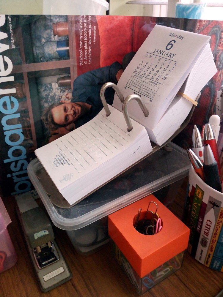
One of the calendar ‘things’ which has been a major item on our Christmas list for many, many years is a Bunch-Of-Dates.  A delightful play on words (perhaps conjured up by a light-hearted printer) it consists of a shaped metal frame which goes through the two holes in a square block of paper containing 365 day leaflets plus a tiny yearly calendar and national holiday dates.  An added bonus is daily quotations from inspiring people.

This pre-internet invention sits on office desks and when the workers begin their day, they flip over yesterday’s date to reveal all the chores they have to do today.  Every job I ever worked in from 1970s onward had Bunches-of-Dates sitting on staff desks or the reception desk.  Yes, I actually still use this old-fashioned device and it is right beside me on my left-hand side.  The date at the top (see photo) with lines at the bottom.  Yesterday, Sunday 5th January 2020, it had approximately seven things written on it, e.g. shopping for a light bulb and To Do things like fill bird bath with water.

You can buy the Bunch-Of-Dates refills for a couple of dollars (a range of office calendars and diaries are printed by Collins Debden) and every year after 1st January, they are renewed across the country.

If they are not used by lazy coworkers who try to remember things and when they can’t, they blame it on you for not reminding them, their blank Bunch-Of-Dates can be used as scrap paper for note-taking.  I sometimes find some thin old wire, like a twist-tie, which I thread through the holes and firmly bind 365 unused days together.  Just the right size for cryptic notes to colleagues or wayward family members.


IMG_20200106_081409
Happy New Year 2020…

Lately I have taken to keeping the last year’s used Bunch-Of-Dates (with exclamation marks, little drawings, council reminders) because sometimes I jot down an important number and don’t transfer it over to my Contacts file.  At this point, I must mention that I have an electronic calendar.  It is most ingenious but no matter how ingenious, it still needs input.  I am very sparing with what I type into my electronic calendar otherwise a lengthy tirade will pop-up at me in the morning when I least expect it.

Another thing; I never ever put stuff on my mobile phone.  Silly, I guess, but they need to be charged and friends say ‘my battery died’ whenever they are late.  An old-school piece of paper in your pocket will never let you down.  That, and a pen, is all you need to survive in the world of words.

But, you ask, what about keeping your favourite calendar photographs?  Goodness, I don’t know where to start!

I have many beautiful scenery images, all totally scribbled on the back, all years old.  But I love them and I often remember the month that went with them.  Except for the one I framed which is three elephants and their passengers splashing down a river in a jungle.  The shallow water is jade green, as vivid as the lush tropical foliage.  There is a feeling of both pleasure and menace.

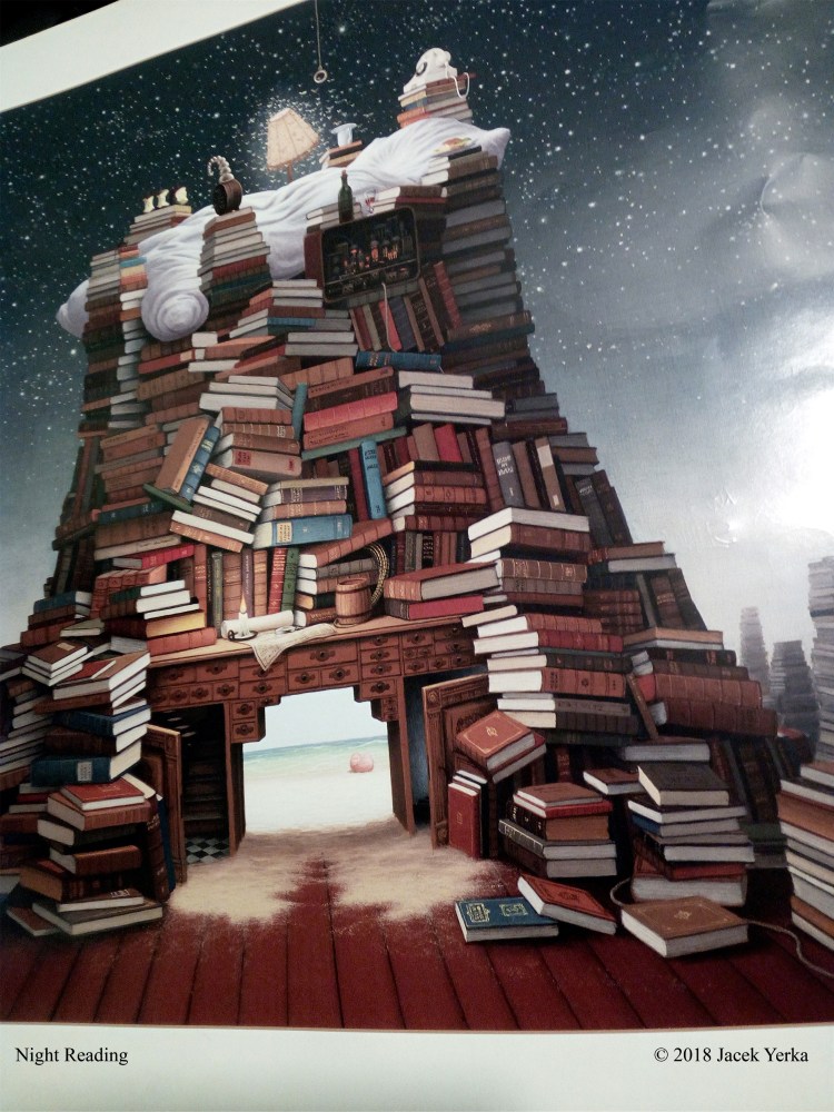
Anyway, a person in my familia has taken a shine to Polish artist Jacek Yerka’s fantasy style and I began to enjoy the ones where he puts hundreds of bookstacks in quirky settings.  I kept this one (see above) perhaps not his strangest, but I get a lot of pleasure out of it.

Every so often I have a surplus calendar, a gift or whatever, so I hammer in an extra nail and hang it up, not as prominent as those I love but I give it hanging space.

And this year?  Oh joy, this year I discovered an Australian Jumbo Big Huge calendar with gigantic squares!  It will take anything I wish to write on it and leave room for more—the down side of this extravagant calendar is no pictures.  There is a tiny strip along the top showing a beach or mountain or city but nothing else.  And one of these images is repeated, not a good look in my eyes.  Ho-hum, can’t have everything.

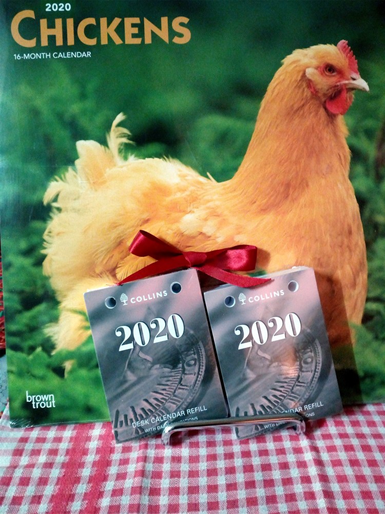
In the kitchen my next favourite is Chickens, not cooked, just hens displaying glorious feathers in beautiful country settings.  Pecking through, it looks like April hens are ahead of the flock photogenically.  I will have to let you know who gets preserved at the end of the year.  Just a minute, I’ll write a note on my calendar…

Gretchen Bernet-Ward


IMG_20191224_173424
This is not an advertisement, just a bit of calendar styling.

Art Deco Delights on Display

IMG_20191014_130309_BURST001_COVER
 

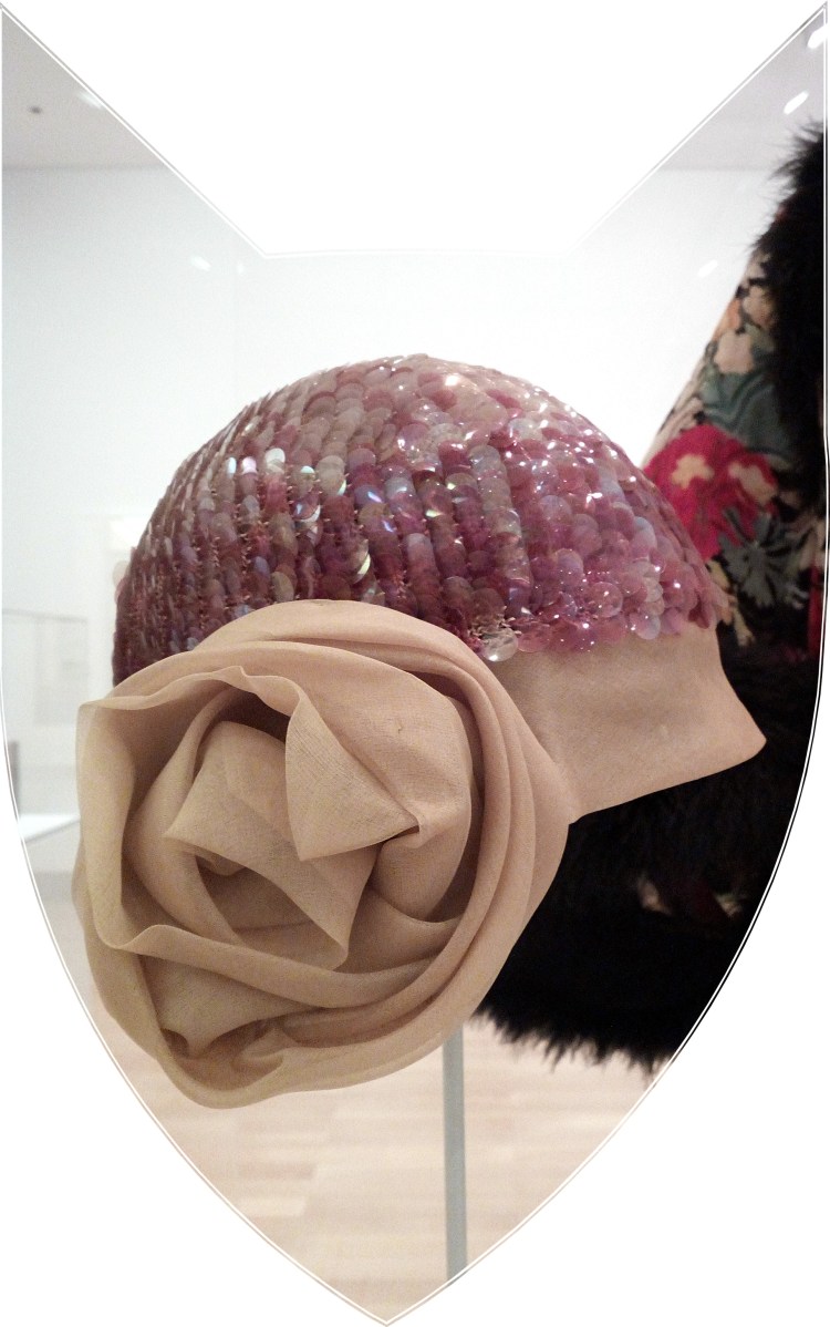
The first photograph shows a Cloche hat (circa 1925) made of rayon, silk organza, sequins and mercerised cotton.  The designer is unknown.  I saw it displayed in the Ipswich Art Gallery exhibition ‘The World Turns Modern’.  It is from the Julian Robinson Collection on loan from National Gallery of Australia.

ART DECO is the predominant decorative art style of the 1920s and 1930s, characterised by precise and boldly delineated geometric shapes and strong colours and used most notably in household objects and in architecture.

Below is my small sample of Art Deco on display.


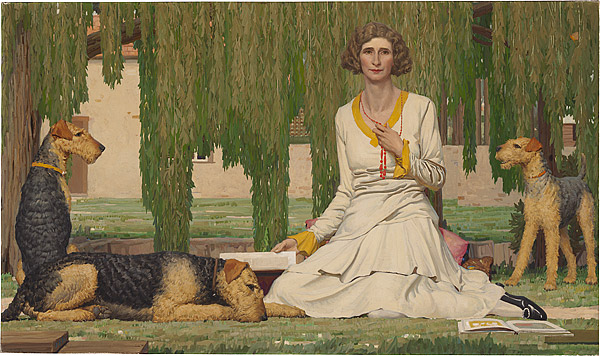
Ipswich Art Gallery Art Deco Lady with Dogs

The first painting to draw my eye was Christian Waller in her garden with her dogs.
Artist :  Napier Waller (Penshurst, Australia 1893 – Melbourne, Australia 1972)
Title :  ‘Christian Waller with Baldur, Undine and Siren at Fairy Hills 1932’
Materials and technique :  Oil and tempera on canvas mounted on hardboard.
Dimensions :  121.5 h x 205.5 w cm, overall frame 1315 h x 2165 w x 60 d mm (big!)
Purchased :  NGA 1984.

“The frieze-like formality of the painting and its cool, crisp colours underscore the demise of the Waller marriage.”  Such a sad note, and I wonder who got the Airedale terriers?


IMG_20191014_123704


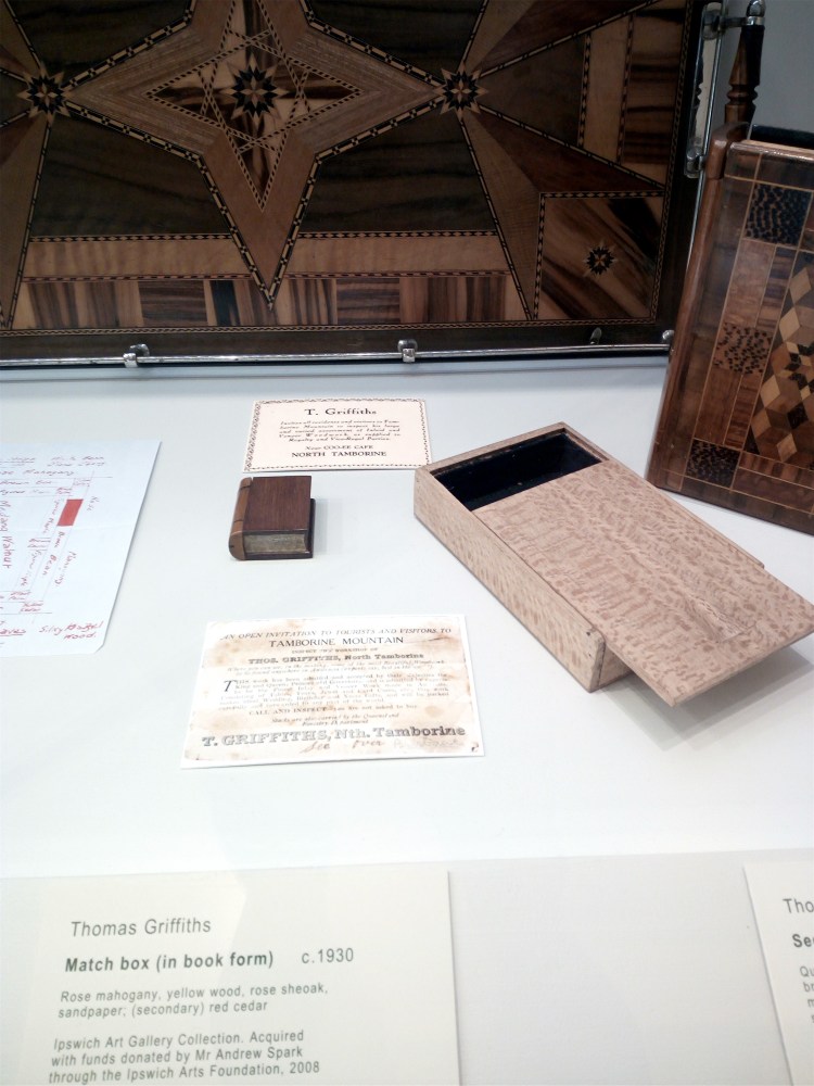
Inlaid wood was all the rage and this match box (in book form) took my fancy.  As the information card states, it comprises rose mahogany, yellow wood, rose sheoak, sandpaper and red cedar.  Rare commodities nowadays.


This stunning bronze cast (in relief) features a woman wrangling two horses; I liked the strength, energy and symbolism of this piece.  Jean Broome-Norton’s renaissance woman is not life-size but the plinth gives it height and power.


The modern front doors of award-winning Ipswich Art Gallery, and inside the original building has been restored and extended.  The shipping and travel poster hints at women enjoying greater freedom, the right to vote and travelling unchaperoned.  The image of the independent woman became popular in graphic design for posters and portraiture.


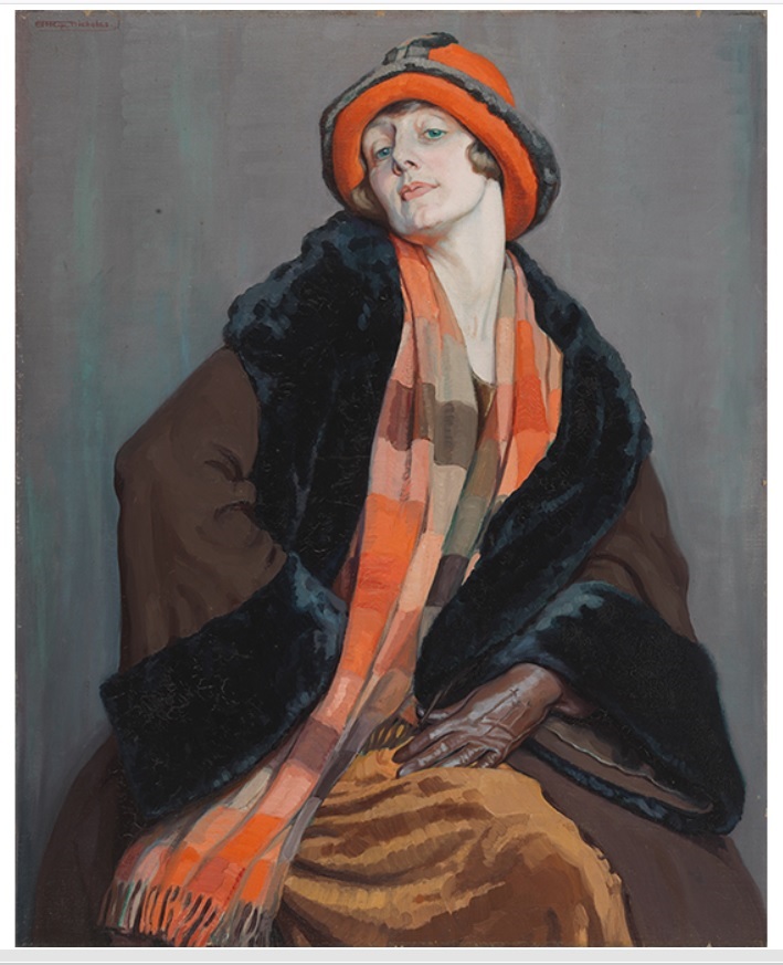
Ipswich Art Gallery IMAGE Hilda Rix Nicholas Une Australienne 1926
 
 
This painting appears on gallery advertising posters and epitomises the era.
IMAGE: Hilda Rix Nicholas ‘Une Australienne’ 1926.

Oil on canvas. National Gallery of Australia, Canberra. Purchased 2014.
© Bronwyn Wright.


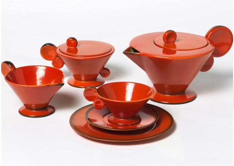
Ipswich Art Gallery Art Deco Red Teapot and Teacups
 

Unfortunately my photographs of etchings, square teapots and Lalique glassware did not work due to the lighting.  Pictured above is a red Art Deco tea-set of stunning design, quite petite, which may not have been easy to sip from if you were feeling nervous at a polite society soirée.


Left photo :  In a side gallery, I viewed ‘Cover Story: Queensland Arts Council Cover Art and Poster Collection 1981 to 2008’ displaying commissioned work by leading Australian artists and illustrators.  From rough sketches to finished art, it was fascinating to see such big names especially in children’s literature, for example Graeme Base, and my favourite Alison Lester and her 1991 on-tour directory cover.

Right Photo :  Upstairs in the heritage gallery, I just had to take a photo of this wonderful 1895 miner’s brooch which I presume was designed for a man but it is small and delicate.  Made of 15ct gold, it may have been used as a tie pin, and the case is about the size of a snuff box.


IMG_20191014_135211
 

Time for a cuppa at the Post Office Café.  I was impressed how the colour and table setting matched the Art Deco theme without really trying.  The proprietor of the café told us that she was sick of washing the tablecloths and they were being replaced with inlaid lacquered tabletops.  Shame, but the sweet treats were delicious.


IMG_20191014_141459
 

The view outside had interesting angles and contrasts; the Post Office Café courtyard, the umbrella, the modern buildings and above, as if floating, the original Ipswich Post Office clock tower, circa 1890.


If you are interested in the Art Deco exhibition, get in quick, it closes this weekend!


07 Sep 2019 – 27 Oct 2019

“Comprised entirely of works selected from the National Gallery of Australia collection, this exhibition provides superb examples of the diverse expressions of Art Deco.”

Gretchen Bernet-Ward

My Monoprinting Experiment

French artist Paul Gauguin (1848 – 1903) used monoprinting to created beautiful works of art.  Most were not acknowledged in his lifetime but I had the opportunity to try his technique.

The workshop I attended was run by Brisbane Botanic Gardens Mt Coot-tha.  Everyone met at the BCC Library and then walked down to the activity room.  Our instructors were Frances and Lee-anne and their introduction covered the evolution of Australian native plants, the background to Gauguin’s work and monoprinting.   A monoprint is a one-of-a-kind print that forms part of a series.

It was a two-hour class with about twelve people and we were itching to get started.  We couldn’t wait to peruse the beautiful and aromatic array of Australian native plants ready to make our imprints.

Here is my quick overview


IMG_20190319_111613

Beginners Guide to Monoprinting


  • You may have read that monoprinting is an age-old printmaking method which produces a single image.  I’d have to say that is only partially correct – the image can be reversed or added to several times, each time producing a different image.  (See my coloured prints above).


  • I rolled out four paint blobs (yellow and red) on an acetate pad, added a leafy tree branch and a clean sheet of paper on top before smoothing it out flat.  Peel off.  Two for the price of one!  I placed ferns and leaves with the branch, added fresh paper on top, pressing down hard.  I reversed the procedure and did ‘mirror’ images.


  • You may have heard that you need lino or woodcarving tools.  I used a wooden chopstick to press and draw my B&W designs.  There were several which didn’t make the grade and I tried to choose the better ones.  (See my black and white prints below).


  • It is thought that you need to work on a glass plate or gel plate, but a sheet of tough plastic (clear heavy acetate) works well with monoprinting paints and is easy to clean.  Of course, you can upscale your equipment when your hobby turns into a money-making enterprise.


  • A special roller isn’t really necessary to spread the paints, you can use a small rubber roller with a plastic handle.  No flattening press needed.  Once the overlay paper is in place, you can use your hands to smooth the paper flat, or add background patterns through the paper with the tips of your fingers.  


  • Pigmented paints and printing inks produce colours which look great but the traditional black-and-white looks dramatic.  I didn’t achieve any depth to my work but the middle black-and-white print (below) is reversed and the hatching in the background was done with the backs of my finger nails.


  • We ran out of time and I would have loved to have dabbled more.  The free class I attended supplied the equipment – plus afternoon tea – and the paper used was office A4 size.  It was porous enough and strong enough to take my amateur efforts.


IMG_20190319_110512
My words of encouragement “You have to try it, muck around with it, get messy and see what happens”

The trick is to work fast, especially in Queensland temperatures, because the paint will dry quickly.  Drying caused one of my prints to have a ghostly quality.  That was part of the fun – the results were often a surprise.

Monoprinting is a forgiving and flexible technique, experimental yet satisfying, and several participants achieved a pleasing degree of botanical detail worth framing.

Gretchen Bernet-Ward

Leonardo da Vinci said…

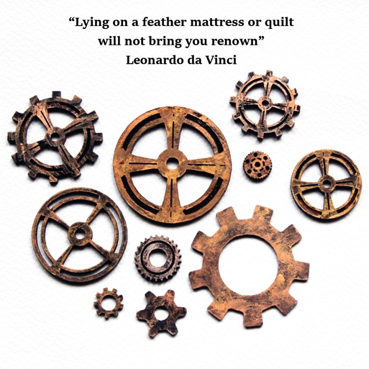
Gears and Cogs 15 Quotation
Renaissance genius Leonardo da Vinci (1452-1519) was a painter, sculptor, architect, inventor and student of all things scientific but he had difficulty waking up in the morning. He wrote “Lying on a feather mattress or quilt will not bring you renown”. One of his earlier inventions was a personal alarm clock powered by water. Based on his elementary diagrams, Leonardo’s device would trigger an alarm by the collection of water dropping into a reservoir at brief intervals. I would have thought the drip, dripping of water all night would have kept him awake. Website https://www.leonardodavinci.net/ Gretchen Bernet-Ward

Skateboarding

IMG_20181008_080157
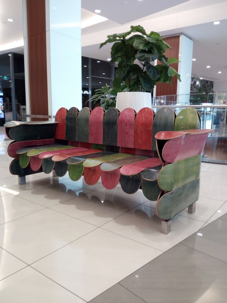
“Skateboarding is more exciting than regular sports, more fun than going to the gym, cheaper than therapy, quicker than walking, more real than anything else” or you can make them into a chair.

Gretchen Bernet-Ward

Miniature Works of Art

After browsing the magazines at our local newsagent, I head for the greeting card section, well-stocked with original, colourful and varied cards, all shapes and sizes for all occasions.

My eye is always caught by a card which I think would suit the receiver.  Even if there’s no occasion on the horizon, I’ll buy the greeting card so I’m prepared.

This bookcase artwork is my latest purchase which came with a shiny gold envelope – I love it so much I don’t think I’ll mail it to anyone!


IMG_20180928_181134

Title M137 Bookshelves
Designed by Jane Crowther © 2016
Published by Bug Art Ltd, Nottingham, England UK
Website http://www.bugart.co.uk


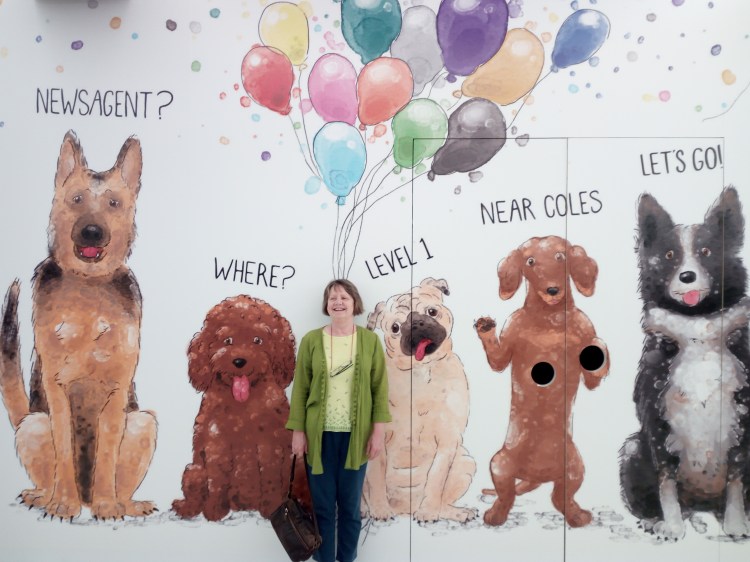
Another newsagent and stationery shop is undergoing renovations.  The dog paintings make a nice change from blatant fashion store hoardings.  Balloons or thought bubbles?

Gretchen Bernet-Ward

IMG_20181008_075625

Jane Milburn Slow Clothing Advocate

Slow Clothing reflects author and refashion advocate Jane Milburn’s own unique style, independent of “fast fashion” trends.  Upcycled from denim jeans, the dress Jane wore during her talk at a local BCC library had the potential to look strange but was distinctive and quite beguiling.

Jane, sustainability consultant and founder of Textile Beat, touched on several key elements during her talk––environmentally unfriendly fabrics and dyes; sweat shop labour; landfill; passive fashion; synthetic vs natural fibre; signature style and minimal wardrobe.  Hot topics included recycle by exchange, shopping tips, Sew It Again mending and creating new from old.  Jane tends to hoard fabric offcuts and used buttons, and has a passion for real cotton thread.

Rethinking clothing culture doesn’t mean wearing your clothes until they fall apart at the seams, it means mindful immersion, repairing and refashioning your garments.

An attentive audience, Jane encouraged us to make thoughtful, ethical, informed choices to reduce our clothing footprint on the world.  Until recently, she regularly visited charity shops for secondhand garments but is currently resisting the temptation and working with what she’s got.  “We believe secondhand is the new organic and mending is good for the soul.  In return, we are liberated and satisfied.”

In her book Slow Clothing: finding meaning in what we wear Jane shares insights and upcycling advice.  She has created templates like Upcycled Collar and History Skirt, guiding home sewing conversion of a beloved garment to reflect the changes in our lives.

To provide meaning and story to her own favourite pieces, Jane Milburn restyles and sews her clothing by hand.  Currently testing t-shirt cotton drawstrings as an alternative to underwear elastic (elastic is made from synthetics) Jane stitches everything by hand.

Help! I can hear you say, nobody has hand-sewn an outfit since the mid-twentieth century––except maybe Vivienne Westwood––but don’t panic, Jane’s book provides testimonials, illustrations and clear instructions for eco-dyes and upside-down jumper skirts through to sewing on a button.  Eco-fashionistas unite!

Although Slow Clothing is a multifaceted, easy-to-read book with positive chapter headings (Purpose, Authenticity, Creativity, Action, Autonomy, Reflection) amid the ingenious apparel, I am missing a frivolous note, perhaps a ball gown?  On a serious mission, Jane has created a Slow Clothing Manifesto with ten tags to keep in mind when out shopping: think, natural, quality, local, few, care, make, revive, adapt, salvage.

IMG_20180723_091617Quotes from Jane embody the Slow Clothing philosophy “Slow Clothing brings wholeness through living simply, creatively and fairly” and “We buy thoughtfully, gain skills, and care for what we wear as an embodiment of ourselves.”  Personally I am hoping to see people clutching their Slow Clothing Manifesto cards at an op shop near me.

The current trail Jane Milburn is blazing makes fascinating reading.  Arts Queensland, meeting VIPs, War on Waste ABCTV, visiting 103-year-old Misao Jo in Osaka, hosting a Clothing Repair Café, conducting workshops and championing natural-fibre, Jane says “It has been personally satisfying to see the uptake of upcycling as a conscious practice with many young people interested in its potential for customising their clothes.”

Unfortunately I didn’t get to ask Jane Milburn how we go about combating the greed of designer labels.  But the clear message is––help reduce landfill by upcycling your clothes to reflect your own unique style.

Gretchen Bernet-Ward

HRH Queen Elizabeth II Birthday

In UK, Her Royal Highness has two birthdays each year: her actual birthday on 21st April and her official birthday usually the second Saturday in June.  Born in 1926, at the time of writing, she is 92 years-old and still going strong.  Happy birthday, Your Majesty!

The birthday of reigning monarch Queen Elizabeth II is celebrated at different times of the year throughout the world and usually accompanied by a public holiday.  In Australia, each State and Territory has decreed a different day.

In Queensland (named after Queen Victoria) we have a Monday holiday in honour of the Queen’s birthday and enjoy a long weekend.  This year it falls on Monday 1st October 2018 and Brisbane residents will head to official celebrations, BBQs, coastal regions, rainforest walks or just laze around at home and read a book.

Gretchen Bernet-Ward
“God Save Our Gracious Queen”

View my blog post about my own umbrella
https://thoughtsbecomewords.com/2018/03/02/childhood-status-symbol/

The Power of Doodling

In between writing and not being published, I attempt to draw, which defaults to my basic doodle setting.  My mind slips out of gear when doodling.  I drew a curlicue doodle which ended up with a small snail at the end of it.  Significant?

Is there a better chance of being published if you illustrate your own bookcover?  Nope.  Even with children’s picture books, there’s no guarantee it will be snatched off the slush pile because of the synchronicity of your fresh-faced pictures and curlicued words.  In fact, in Australia the editors prefer to nominate an artist so forget that plan.  Still, I can’t stop myself doodling.  What use is it?  (A) tension release, (B) learning aid, (C) mind clearer, (D) mind-wanderer, or who knows what.  Ah ha, light bulb moment!  I will research the experts and see what they have to say on the subject of Doodling 101.

Prepare to be bored, please doodle among yourselves – preferably with a real pen or pencil.

First up are the good news listicles and powerful headings:
  • 4 Benefits of Doodling | Examined Existence
  • 5 Big Benefits Of Being A Doodler | HuffPost – Huffington Post
  • 7 Ways Doodling & Colouring Benefit Your Brain | Care2 Healthy Living
  • 7 Benefits of Doodling and How to Get Started – Daring to Live Fully
  • Doodling Your Way to a More Mindful Life | Psychology Today
  • How Doodling Benefits Your Brain – Kendal at Home
  • How Doodling Makes You Smarter | Reader’s Digest
  • Study: Doodling Helps You Pay Attention – TIME
  • Science: Doodling Has Real Benefits For The Brain – Fast Co. Design
  • The Power of the Doodle: Improve Your Focus and Memory – WSJ
  • The Cognitive Benefits of Doodling – The Atlantic
  • The “Thinking” Benefits of Doodling – Harvard Health Blog …..

….. had enough?

You can’t get out of it that easily!

Here’s what JournalWeek had to say in a non-scientific wayDoodling comes from the word doodle – a habit of unfocused or unconscious drawing a person makes while his attention is actually occupied by something else.  Doodles are generally simple and sometimes nonsense drawing that may have definite representational meaning.

Today, doodling is fondly considered a ‘national’ pastime mainly because it is done by a lot of people in different settings, but mostly in classrooms and offices.  <Using a pen, or more recently using laptop, tablet or smart phone apps>  Some examples of doodling are found in school notebooks, mostly in the margins, caused by a student who is either lacking interest in the class or day dreaming. Another example is when someone is having a long telephone conversation while a pen and paper are within range.

What’s interesting about it?  For many people, it’s just a typical way of occupying themselves. Not a lot of them realise that doing it does actually provide some benefits.  Let’s find out how…

Memory Link:  Admit it – you doodle perhaps in most instances where there is a chance to. Most of us could not deny it because we have developed the habit as students.  What you remember and what sticks in your mind are usually the things you doodle. For instance, it can be trees you always see outside your bedroom window, logo of your favourite team, or the name of your favourite band, singer or celebrity.

The products of doodling are the images and words coming out of your subconscious mind. Although they seem to be of no significance, they can actually be helping you in learning and grasping knowledge.

One health benefit of the habit:  According to the Applied Cognitive Psychology study, doodling allows us to be able to effectively recall information hidden within our subconscious. The same research found out that the people subjected to the experiment that filled in shapes while listening to the phone had a better memory retention or recall percentage. The different is about thirty percent compared to those people who did not doodle.

Being Productive:  Although not yet proven, the hypothesis is that the habit itself is effective in minimising and combating daydreaming and absentmindedness.  But the power of doodling is not limited within the bounds of memory and recall alone. There is a widespread belief that it, in fact, corresponds to empowering one’s intellectual prowess. As it appears, someone who’s doodling seems to be distracted or plainly unfocused.

However, this is an activity that gives the brain an awkward but beneficial exercise of engagement and processing of complicated thoughts and ideas. Likewise, those who rely on their talents of creativity also use doodling to unlock that artistry and creativity in them.

Not convinced?  Read about some of the most notable people in history who themselves admit that the habit has in fact helped them focus, recall, and literally make use of their brains. The list includes the likes of Leonardo DaVinci, Sylvia Plath, Presidents Bill Clinton, Ronald Reagan and Thomas Jefferson, as well as poet John Keats, mathematician Stanislaw Ulaw, Franz Kafka and Mark Twain.

Therefore, if you have issues about paying attention and focus, doodling will help you deal with those issues. There’s really nothing wrong or you won’t lose anything if you start to developing the habit.  <And maybe gain a small work of art>

Most of this blog post was brought to you by JournalWeek!
“Our aim and mission is to provide our readers articles on interesting facts”
http://journalweek.com/interesting-facts-about-the-power-of-doodling/

I think the saddest doodle belongs to Jorge Luis Borges, writer, essayist and poet, who drew a self-portrait after he had gone blind.

Jorge Luis Borges Self Portrait When Blind
Jorge Luis Borges self portrait when blind

“I have always imagined that Paradise will be a kind of library”
– Jorge Luis Borges (1899-1986)

Gretchen Bernet-Ward
IMG_20180331_162029

Your House, Your Story

Red Tractor Designs Rachael Flynn

I love the homey words and clean, familiar lines of Rachael Flynn’s artwork.  She lives on a cattle and sheep farm in a locality called Piambong which is about 25km north-west of Mudgee, NSW, Australia.  Her calendar (above) features rural farm life with a quirky theme and seasonal recipe each month.
Website http://www.redtractor.com.au/

Gretchen Bernet-Ward

IMG_20171218_083228

Book Covers Tell Too Much

Books Bookshelf Old Volumes

Can you tell a book by its cover?  Sure you can!  Just the same as an individual’s personality and clothing can tell something about them, a book lures the reader with an enticing cover image.  That visual reveal, a hint of what’s hidden within the book is a very important marketing tool.

A contemporary bookcover, no matter what the genre or category, has to be identifiable.  It has to look good on publicity material, it has to create a mood and it has to appeal to its target audience.  The font style, back cover blurb and all-important artwork join together to get you interested enough to part with your money.  Unless you are borrowing the book from your local library.  Nevertheless, you will still be interested in that lurid hardback in your hand because it promises so much…just look at that out-of-context quote from a famous author who said “chilling depth” and “sizzling romance” from a “writer with imagination”.

Millions of modern eye-catching bookcovers are perfectly serviceable and practicable and sensible and don’t mislead the intended reader.  It can be argued that bookcover images only hint at a small portion of the entire book.  But, as a person who reads books very closely, I disagree.  I like to make my own assumptions and not be misled by skewed artistry.

Thus I start my LONG bookcover show-and-tell, documenting that which has annoyed me for some time – the all-to-obvious artwork on bookcovers, those illustrations which give the game away.

  • The reveal: I loathe it when the crime bookcover shows the pivotal moment in the book. A dead giveaway!  Is that the graphic artist’s fault for reading the front and back page?  Is it the publisher’s fault for handing out the last chapter?
  • Bookcover clue giveaway: I have just finished a police procedural and the creepy black-and-white cover photo with a rundown house on the hill encircled by barbed wire is actually where the bodies are buried. No kidding, I knew every time the detective went up that hill, he was darn stupid.  Or the one with the sketch of a child on a rocking horse holding a scythe over her shoulder – storyline crumbles before it starts.  Worth mentioning that a rocking horse was not even in the story.
  • Vignettes snipped from a chapter: Like historical fiction “Golden Hill”, where a sketch of the hero is seen on the bookcover leaping across a roof top in true Hollywood style, no doubt aimed at action-loving readers, when the bulk of the story revolves around cruel social hierarchy.
  • A mystery novel: Well, murder actually because several people end up getting killed. This illustration managed to ruin the first three punchlines in the first three chapters.  Not to mention the good guy is seen working in the downstairs office window when his office is upstairs.  Plus the red motorbike heading up the road outside is meant to be him, at the same time.  Lovely drawing but couldn’t they have chosen something more accurate?
  • Overcooked Clones:  There’s the hand frozen in ice (guess how the victim dies) there’s the bridge across the river (guess how the victim dies) there’s the threat (a big dark old building) there’s a corrupt political serial killer millionaire mowing his way through rich widowed neurotic socialites on board his yacht (guess how the victims die) or bones poking out of the earth…black crow…wolf in snow…lonely highway…stark tree…dropped gun…body part…the train racing through the underground station…all overdone crime tropes.
  • To quote Tim Kreider, essayist: “The main principles of design—in books…is your product must be bold and eye-catching and conspicuously different from everyone else’s, but not too much! Which is why the covers of most contemporary books all look disturbingly the same, as if inbred.”  Which leads into––
  • Dark silhouette: I, for one, thoroughly dislike the brooding male or female silhouette in a heavy coat, head down, walking toward a menacing city skyline/bridge on a rain-soaked evening. Boring!  The stock standard photo silhouette has been on countless bookcovers for years.  Think of Lee Child.
  • Expected bookcovers or Clone II:  Why does (1) Romance have the obligatory well-developed over-muscled man and well-developed bust-overflowing woman, and (2) Literary fiction has a sedate, toned, almost elegant layout with a design which purrs good taste?  (3) Non-fiction is so varied it usually has just a colour photo with a word overlay.  (4) Historical fiction will have a woman in period costume gazing at house or hillside.  (5) Children’s books, fantasy and science fiction have a place all their own.  Renegades breaking up the predictable.
  • Flip side: An irrelevant illustration. There are obscure bookcovers like “The Midnight Promise” with two hands shaking as though in agreement when the Promise is nothing like that image.  At least it gave me something to ponder.
  • World-wide: I’m commenting on English language publications and referring to p-books and e-books. I’ve mentioned arbitrary books I have read and tried not to name them.  However, the same book published in different countries gets a different bookcover.  This is where designers and image stock can become tricksy.  I have seen translated children’s books looking very adult, young adult books looking too adult, and adult books looking sugary sweet, e.g. cosy mystery covers with blood-thirsty content between the pages.

Book Sliced Up on Plate with Knife

BONUS:  Terry Pratchett’s bookcovers by artists Josh Kirby and Paul Kidby tell a detailed story.  With fiction, decide how closely you should look.  Decide if you want to undermine the plot.  You may not even notice pictorial clues!  Ask yourself if you are exercising your own freewill, or are you conditioned by a generic bookcover image.

Link to superb 20th century bookcovers from The Paris Review:
https://www.theparisreview.org/blog/2018/02/22/twelve-illustrated-dust-jackets/

Today, the mass market book illustrators, the image makers, appear to acquire design inspiration from their clinical, perfectly sculptured computer programs.  Perhaps they should visit an art gallery, or see what’s shakin’ in the real world, then tell that miserable silhouette model to get lost.

Never stop reading!

Gretchen Bernet-Ward

Postscript : A Tiny Bit of History : Literature has changed in more ways than one over the centuries.  Illuminated manuscripts gave way to smaller volumes with dust covers/jackets in 1820s Regency, then refined in 1920s to make hardback books more attractive.  Before this the majority of bookcovers were a plain single colour with gold embossed wording and little adornment.  Swanky ones did have lithographs or a portrait frontispiece.  It is considered that 1930s paperback printing changed the course of bookcover art.

Lorna Doone by R D Blackmore

Teatowel of Ignominy

Ever do something just for fun?  Sure you have.  From an impromptu picnic to cooking a lavish dinner.  Sporty things, family things, shopping expeditions or entering a competition in the name of fun.

Recently I designed a book-themed teatowel for fun.  There was a prize involved but I won’t dwell on that because I did not win.  However, it did spawn this blog piece…

Tea Towel Design 03
G-B-W©Book Lifecycle artwork (Australia)

For those born into a dishwasher world, I will elaborate.  A teatowel is used to dry crockery and cutlery.  It is made of an oblong piece of linen or cotton material, naturally absorbent, hemmed on all sides and printed with a design.  The design is printed on one side, in portrait position.  Teatowels can be any colour, any theme, but traditionally the same fabric and size.  They can also be displayed poster-like on a kitchen wall.  The following teatowels are not ignominious!

Tea Towel Design 04
Raspberry Thistles©Scott Inness (Scotland)

Tourist destinations sell souvenir teatowels, the most glorious ones are those in public art galleries.  Gift shops offer cute ones with flowers, teacups, recipes or cow designs.  Craft groups use them as fund-raisers, while cookware stores display matching sets of oven mitt, apron and teatowel with a trendy designer logo.

Tea Towel Design 06
Friesian Cows©Rodriquez (Australia)

I have a large proportion of Australian flora and fauna too well-laundered to show here.  The examples displayed are the best I could find in the kitchen drawer.  A lovely giraffe print from Western Plains Zoo, Dubbo NSW, was singed from a cooking incident.  My recently purchased Cecily teatowel (below) is part of a book-themed series from New Zealand.  It will not suffer the fate of another limited edition teatowel which, shock horror, was used to wipe the stove griller.

Tea Towel Design 08
Cecily©Moa Revival (New Zealand)

Teatowels sound old-fashioned and domesticated but they can become the focus of teenage washing-up disputes and used as a weapon to flick people.  Snap!

Tea Towel Design 05
Babushka Dolls©Ladelle (Australia)

Apparently teatowels originated in Victorian England and were used at teatime to keep the china in good condition.  Baked goods were often laid on a teatowel to cool or alternatively kept moist under a teatowel.  The name is different in different countries, in Australia a dishtowel/dishcloth is used for more heavy duty cleaning.

Teacup 001
Tidy teatowel (Unknown)

No doubt there is an online history of teatowels and teatowel aficionados around the world, but I am content in the knowledge that I have owned many useful hard-working ones over the years.  Lightly imbued with nostalgia and sentiment, some were gifts, most I have bought, and one I designed myself which is not destined to be printed.  That’s a good thing.

Gretchen Bernet-Ward


BONUS:
My blog post is laden with afternoon tea foodie photographs
https://thoughtsbecomewords.com/2018/03/11/afternoon-tea-and-fancy-food/
Extra teatowel image courtesy of The National Trust UK
https://www.nationaltrust.org.uk/

IMG_20180403_120406
Made with care in UK for The National Trust 100% cotton.

Screensaver

Sherwood Toilet Block Hives Park 01
Illusion

Walking in a park, I saw this wall of trompe l’oeil on the side of a public convenience block and just had to photograph it.  The illusion, the trick of the eye was something special which I appreciated more after I saw my photograph.  It was painted by local Sherwood (Brisbane) artists with the name Half Dozen Group of Artists Inc.

One of my favourite pastimes is to change my screensaver image.  I do it on my PC and iPad regularly.  Silly obsession, I know, but it gives me a smile when I log on each day.  I take my own photographs wherever I might be, and have a supply of snapshots and artwork amassed from family and friends over the years.  Some work well, some don’t.  “Framing and focus” was the old adage.

Stripey Street Cat 02
Searching

There is a children’s picture book entitled “The Stripey Street Cat” by Peter Warrington and Rachel Williams which is a photographic series of stencilled street art images of a stray cat.  They tell the story of Stripey who is looking for a lost friend, meeting various other Newtown (Sydney) cats along the way.

An illustration I use regularly which attracts attention for all the wrong reasons is this one of Snoopy typing away in the middle of the night with a cigarette in his mouth.  I’m anti-smoking but there’s something naughty about making an icon like Snoopy do such a thing.  The artist is unknown but I think he’d have a good sense of humour.

Gretchen Bernet-Ward

Snoopy Author
Serious


Do You Doodle?

Snail
Snail

Do you still doodle on a notepad or scrap of paper?  When telephones were fixed items, every office had a blotter with notepad and pen handy.  Home phones had a dedicated area littered with paper and old envelopes for note-taking or scribbling a quick message with a stubby pencil.  Doodling came into its own while listening to your boss rant or your mother dispense advice.  It is quite possible that fifty percent of paper used in the world prior to computers and internet access was used for doodling while on the telephone.

It seems we only used half our brain when talking on the phone and, as evidenced today, we had to be occupied with something else at the same time.  Lo, mobile phones were born!  Or in other countries, lo, cell phones were born! With access to a myriad of mind-occupying pastimes.  And you can personalise any device; doodling without pen or paper.  I don’t think it’s necessary to launch into the historic progress of communications over the centuries but I can guarantee it will get more and more streamline, more and more accessible and more and more invasive.  Computer art is not really doodling…

I love curlicues and my featured doodle was penned while I was listening to a podcast so perhaps there is still a time and place for doodling.  I don’t know where that snail came from but I can use any number of tech devices, themes and programs to jazz him up.  Do I want to? Nah, think I’ll just leave him on an old piece of recycled A4 paper.

Happy indeedydoodling!

Gretchen Bernet-Ward


Large Portions of Fast-Paced Comedy

Queensland Theatre Review “Noises Off” QPAC Playhouse Saturday 3 June 2017

Stage Door
Theatre

“Noises Off” theatre production is loud on laughs.

My first experience of Michael Frayn’s stage play “Noises Off” was in 1983 at Savoy Theatre, London, so I was keen to see how Queensland Theatre would handle a 21st century production in Brisbane.  Currently running at QPAC Playhouse, I was already attuned to the chaos about to transpire.

The Queensland Theatre cast cleverly mirror a blemished performance by a supposed theatre troupe in Weston-super-Mare.  This play within a play is an hilarious bedroom farce of abundant innuendo, silly mix-ups and a display of Libby Munro’s white underwear.  Simon Burke neatly portrays director and libertine Lloyd Dallas with a droll delivery, and Nicki Wendt and Hugh Parker evolve nicely as bemused husband and wife.  Cast flexibility is spectacular, especially athletic Ray Chong Nee who channels Roger Tramplemain, and Louise Siversen as spry housekeeper Mrs Clackett.

Strong language crops up but it appears that most dialogue, costumes and props are relatively unchanged, with crafty set design advancing the action behind-the-scenes.  Authentic director Sam Strong has handled “Noises Off” with finesse and his cast of nine prove that Brisbane audiences can absorb large portions of fast-paced comedy without losing the plot.

Gretchen Bernet-Ward

Noises Off Stage Set
Set Design